Add a Pie Chart Indicator Directly in Your SharePoint List - April 21, 2025
Visualizing Data with Pie Charts in SharePoint: A Comprehensive Guide
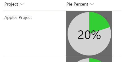
Pie charts are a universally understood method to represent percentage values in data. Their simplicity and effectiveness make them a popular choice for visualizing statistics across various domains. Within the realm of SharePoint, a powerful collaborative platform used widely in organizations, the integration of pie charts can significantly enhance the way data is presented and interpreted. The introduction of the SharePointDashboards.com Pie Percent indicator elevates your SharePoint list column, allowing users to visualize percentage data effectively and create visually appealing SharePoint Dashboards.
Understanding the Power of Pie Charts in Data Visualization
Pie charts depict data in a circular form, with slices representing portions of a whole. This visualization method is extremely effective in showing percentage distributions, making it easier for users to interpret data quickly. The ability to customize the appearance of these charts in SharePoint adds a layer of personalization and functionality, making them highly adaptable to different reporting needs.
Integrating Pie Charts into SharePoint
With the SharePointDashboards.com Pie Percent indicator, integrating pie charts into your SharePoint list becomes a seamless process. Whether you aim for a small pie chart as a status indicator or a larger, more pronounced chart for detailed analysis, the customization possibilities are extensive. The color-coding feature allows the chart to adapt based on defined percentage threshold values, which can help in quickly identifying key performance metrics and variances.
No-Code Setup: Simplifying SharePoint Customizations
One of the standout features of the SharePointDashboards.com template is its simplicity; it doesn't require any programming skills. Users can simply copy the template from the SharePointDashboards.com site and paste it directly into a SharePoint number field. This ease of setup ensures that even users with minimal technical expertise can enhance their SharePoint lists with professional-looking pie charts.
Applications in Charting and Status Indicators
Incorporating pie charts into SharePoint can streamline charting processes and improve status indicators. By visually representing completion levels, pie charts can act as immediate visual status indicators, signifying whether an aspect of a project is on track, behind schedule, or completed. This visual cue simplifies decision-making processes by allowing users to quickly gauge project health at a glance.
Enhancing Project and Employee Management
In project management, visual tools like pie charts are indispensable. They provide project managers with rapid insights into task completion rates or resource allocation. For employee management, these charts can depict performance data, such as the percentage of target achievements or engagement metrics. Such applications help ensure transparency and facilitate more informed managerial decisions.
Real-World Use Case Scenarios
Consider a scenario in a marketing department where teams need to track campaign progress and results. The integration of pie charts into SharePoint lists enables teams to swiftly visualize the percentage of work completed or remaining tasks. Similarly, in HR departments, pie charts can represent data on employee training completion rates, thus supporting strategies for workforce development.
In a manufacturing setting, a SharePoint list could include columns for each production phase. The Pie Percent indicator could visualize the percentage completed in each phase, providing an at-a-glance update for managers overseeing multiple production lines.
Using SharePoint JSON Formatting
The customization of pie charts in SharePoint is powered by JSON formatting. This powerful feature in SharePoint allows users to format list views and columns by applying transformations using JSON objects. Applying the SharePointDashboards.com template involves inserting a pre-configured JSON into the column's formatting settings. This process modifies the appearance of your SharePoint list without requiring additional software or coding knowledge.
SharePointDashboards.com: Facilitating Data Visualization
SharePointDashboards.com serves as an invaluable resource for SharePoint users looking to enhance their data visualization capabilities. By providing ready-to-use templates like the Pie Percent indicator, it empowers users to take full advantage of SharePoint's potential to create informative, visually appealing dashboards that reflect key business metrics.
Conclusion
The integration of pie charts into SharePoint via the SharePointDashboards.com Pie Percent indicator is a game-changer for anyone looking to improve their data presentation skills. From project managers to HR professionals, and marketers to manufacturers, the benefits of enhanced data visualization are clear. By leveraging the simple, no-code solutions provided by SharePointDashboards.com, organizations can foster better data understanding, streamline project management processes, and make more informed decisions.
|
