Add Priority Indicators to your SharePoint Lists - April 19, 2025
Understanding Priority Indicators in SharePoint
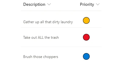
In the realm of project management and organizational productivity, keeping track of task priorities is paramount. Being able to visually differentiate between high, medium, and low priority tasks can streamline processes, boost efficiency, and ensure that important tasks are not overlooked. SharePoint users have a handy tool at their disposal: the priority indicator. This visual status indicator provides immediate insight into task prioritization through color coding, making it an invaluable asset in managing projects and teams.
How Priority Indicators Fit into Charting and Project Management
Priority indicators are a fundamental component of charting and project management. These indicators typically utilize colors to denote the level of urgency or importance of a task, allowing team members to quickly ascertain which tasks require immediate attention and which can afford to be scheduled for later. By integrating such visual cues into project management tools, organizations can significantly enhance communication and keep everyone aligned with overall project goals.
Incorporating priority indicators into charting systems can also simplify the visualization of data. For example, in a Gantt chart or a Kanban board within SharePoint, priority indicators offer an at-a-glance view of task status without the need to delve into detailed descriptions or notes. This capability is not only time-saving but also minimizes the risk of misinterpretation, leading to more efficient project expenditure and resource allocation.
Implications for Employee Management and Tracking
Priority indicators are equally impactful when applied to employee management and tracking. Managers can assign tasks with specific priority levels, ensuring that employees are clear about which tasks to tackle first. This clarity fosters an organized and goal-focused work environment in which employees can manage their workloads more effectively.
In terms of tracking, priority indicators serve as a historical record of how priorities have shifted over time, reflecting changes in project scope or organizational direction. By maintaining these records, managers can analyze and optimize workflow processes, improving future project planning and execution.
Implementing Priority Indicators in SharePoint
The SharePointDashboards.com Priority Bubbles template simplifies the process of integrating priority indicators into SharePoint. This free template allows users to apply a color-coded visualization to priority columns within SharePoint lists. Regardless of the user's coding proficiency, this template is easy to implement, thanks to its straightforward copy-and-paste functionality.
Setting Up in SharePoint Using Templates
To add priority indicators to your SharePoint list, navigate to SharePointDashboards.com and download the Priority Bubbles template along with 21 other available templates. Applying this template to your list involves copying the provided JSON code and pasting it directly into the relevant SharePoint field. No programming knowledge is required, making this a user-friendly solution for companies of all sizes.
Use Case Scenarios for Priority Indicators
Priority indicators prove beneficial across various scenarios:
1. Project Deadlines: In a project management environment, tasks approaching a deadline can be marked as high priority in red, ensuring all team members are aware of impending due dates.
2. Customer Support: Helpdesks and support teams can use priority indicators to manage customer queries. Urgent issues can be tagged in red, medium in yellow, and low priority in green, allowing agents to address pressing issues first.
3. Resource Allocation: For departments managing multiple projects simultaneously, priority indicators help determine where to direct resources and manpower most effectively, avoiding bottlenecks.
4. Administrative Support: Administrative teams can use priority indicators to organize meetings and events, ensuring that high-priority engagements are handled with the utmost attention and timeliness.
SharePoint JSON Formatting Explained
JSON (JavaScript Object Notation) is a lightweight data interchange format that is easy for humans to read and write. In SharePoint, JSON formatting is used to customize how fields in a list view are displayed. By applying the SharePointDashboards.com template, you apply a JSON file that defines the visual appearance of your priority column. This customization facilitates the swift identification of priority, using different colors to represent high, medium, and low priority levels.
Conclusion
In conclusion, priority indicators are an essential visual status tool that can help organizations manage tasks and resources efficiently. The adoption of the Priority Bubbles template from SharePointDashboards.com provides a seamless method to implement this feature, enhancing clarity, communication, and productivity across various organizational functions. By leveraging these tools and strategies, companies can maintain a competitive edge and foster a more effective and agile working environment.
|
