Introduction to Grouped Bar Charts in SharePoint
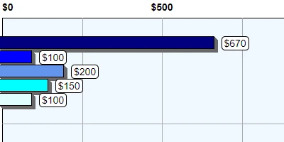
A grouped bar chart, also known as a multi-series bar chart, is a powerful visualization tool used to compare data trends across different categories simultaneously. Imagine combining multiple bar charts into a single, comprehensive view that enables side-by-side comparisons. This visualization technique significantly enhances your ability to interpret complex data, offering a clearer picture of relative performance or progress across various dimensions.
While SharePoint is a robust platform for team collaboration and document management, it does not inherently provide the capability to create grouped bar charts. Although Microsoft Power BI offers extensive tools for data analysis and visualization, it often comes with steep costs and a time-consuming setup. Fortunately, SharePointDashboards.com provides an affordable and straightforward solution by offering a Grouped Bar Chart Template, among 35 other charting templates, that integrates seamlessly with SharePoint.
The Role of Grouped Bar Charts in Data Visualization
Grouped bar charts stand out due to their ability to provide detailed insights at a glance. Here's how they add value:
- Comparative Analysis: By displaying multiple data sets within the same category on individual bars, grouped bar charts enable easy comparison.
- Enhanced Insights: They facilitate trend analysis across diverse categories, offering valuable insights into performance metrics.
- Resource Allocation: With clear visual representations, organizations can better allocate resources based on performance metrics.
- Quick Decision Making: The clear depiction of extensive data helps decision-makers to quickly ascertain actionable insights.
This form of visualization is particularly beneficial in areas of project management, employee performance tracking, and resource allocation.
Integrating Grouped Bar Charts into Project Management
In the realm of project management, grouped bar charts play a crucial role in visualizing project timelines, resource allocation, and performance metrics. Here's how they fit into project management:
- Project Timelines: Compare progress across different teams or phases of a project, helping identify bottlenecks or areas needing attention.
- Resource Management: Visualize resource usage across multiple tasks, ensuring effective allocation and balancing workloads.
- Performance Metrics: Track project progress against objectives, comparing outcomes against targets to assess effectiveness.
By employing grouped bar charts, project managers can maintain better control over project variables, facilitating timely project delivery and optimized resource use.
Enhancing Employee Management and Tracking
Grouped bar charts are also invaluable in employee management and tracking:
- Performance Comparisons: Line up multiple employees side by side to assess relative performance over distinct periods.
- Skill Gap Analysis: Visualize and compare employee skill levels, identifying training needs and potential promotions.
- Productivity Tracking: Measure productivity trends over various phases or projects within different teams or departments.
Such visualization tools ensure managers are equipped with the necessary information to make informed personnel and development decisions.
Leveraging SharePointDashboards.com for Enhanced Charting
For organizations using SharePoint, integrating grouped bar charts has become much simpler with SharePointDashboards.com. Here's how you can effectively use this platform:
- Simplicity: No software installations are required. Users can set up their chart by adjusting settings at SharePointDashboards.com and then copying and pasting the template to their SharePoint site.
- Cost-Effectiveness: The platform offers numerous charting templates, including grouped bar charts, at a low cost. New users also have access to 21 free templates.
- Customization: Tailor the grouped bar chart templates to suit your organization's specific needs and data structures.
If you aim to add robust charting capabilities to your SharePoint environment without incurring high costs, SharePointDashboards.com stands as an excellent option.
Understanding SharePoint JSON Formatting
An essential aspect of creating grouped bar charts in SharePoint involves JSON formatting. SharePoint JSON formatting allows users to customize the appearance and behavior of list views, adding visually appealing components to otherwise plain lists.
To create a grouped bar chart, a template from SharePointDashboards.com can be applied seamlessly using JSON. This involves a few simple steps:
- Download or copy the desired chart template from SharePointDashboards.com.
- Apply the JSON template to your SharePoint list view.
- Customize the fields to match your data structures, ensuring that visualization reflects the accurate performance metrics.
This method of using JSON in conjunction with SharePoint's features offers a powerful way to visualize complex data, making interpretation more intuitive and impactful.
Use Case Scenarios for Grouped Bar Charts
Here are a few practical scenarios where grouped bar charts can significantly enhance data comprehension and decision-making:
- Sales Comparisons: Businesses can use this chart to compare sales performance across different regions or product lines, identifying top performers and areas for growth.
- Academic Institutions: Universities can visualize student performance metrics across various departments or study programs to better understand educational outcomes.
- Healthcare Facilities: Hospitals can track patient recovery statistics across different treatment plans, optimizing care protocols based on visualized data.
By employing grouped bar charts, organizations across diverse industries can unravel complex data trends to drive improvement and excellence.
Conclusion
Incorporating grouped bar charts into SharePoint empowers organizations with enhanced capabilities for analyzing and visualizing data trends. Despite SharePoint's inherent limitations in creating such charts, platforms like SharePointDashboards.com offer a crucial service by providing affordable and easily implemented chart templates. With the capability to visualize data in meaningful ways, businesses and institutions can facilitate better decision-making, resource optimization, and performance tracking across various operational spheres.