An Introduction to Radial Gauges in SharePoint
The use of visual indicators in project management systems such as SharePoint is invaluable for tracking progress and managing resources effectively. One such visual indicator is the radial gauge, a tool akin to a pie chart, known for its circular shape that fills according to a percentage value. This article explores the functionality of radial gauges, their integration into SharePoint, and their potential uses in managing projects and tracking progress.
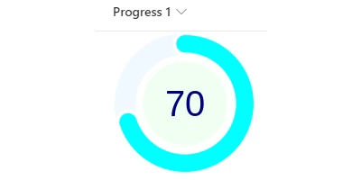
The Radial Gauge: A Visual Progress Tracker
Radial gauges offer a compelling visual representation of progress in various applications, notably in project and employee management. Their circular form intuitively displays information, making it easier to understand at a glance. Unlike traditional bar charts, radial gauges leverage circular symmetry to communicate completeness, instantly showing how much of a task or project is finished.
Integrating Radial Gauges with SharePoint
One of the significant advantages of using radial gauges is their compatibility with SharePoint through simple integration processes. Templates available at
SharePointDashboards.com provide users with a seamless method to incorporate these gauges into their SharePoint sites. Users can customize elements such as colors, borders, and sizes to match corporate branding or specific project themes.
Setting Up Radial Gauges Using Templates
To set up a radial gauge in SharePoint, users can employ the template available at SharePointDashboards.com. The process is straightforward: adjust the settings until the desired preview is obtained, then deploy by copying and pasting the generated code into the appropriate SharePoint site location. This ease of use streamlines the setup process considerably, allowing even those with minimal technical skills to implement advanced data visualization.
Radial Gauges in Charting and Project Management
Radial gauges are an integral feature when considering charting in project management. Their ability to represent percentages visually aligns well with project tracking needs, providing immediate insight into project completion rates. By incorporating these into SharePoint, project managers can efficiently communicate the progress status to stakeholders, enhancing the decision-making process through clear visual cues.
Use Cases for Radial Gauges
Radial gauges are versatile and can be applied in numerous scenarios:
- Project Progress Monitoring: Displays overall project completion, helping managers identify whether tasks are on schedule.
- Sales and Revenue Tracking: Visualize quarterly or monthly sales targets against actual sales achieved, aiding in performance assessment.
- Resource Utilization: Illustrate employee capacity against current workloads, optimizing resource allocation.
- Goal Setting and Achievement: Demonstrates progress towards personal or team goals, fostering motivation.
Visual Status Indicators in SharePoint
Implementing radial gauges in SharePoint as visual status indicators enhances traditional list displays, providing color-coded progress descriptions. This graphical representation simplifies data interpretation, particularly for complex data sets, making it easier for employees and stakeholders to comprehend at a glance.
Employee Management and Tracking
Radial gauges assist in monitoring employee performance by visualizing key performance indicators (KPIs) in SharePoint. Managers can quickly assess task completion rates and efficiency levels, identifying top performers and those needing improvement. This, in turn, aids in making informed decisions regarding training, resource distribution, and employee evaluations.
Innovative Use of SharePoint JSON Formatting
The introduction of SharePoint JSON formatting allows for even more dynamic list view customization. By applying a JSON template to a SharePoint list view, organizations can create visually striking data layouts. This involves defining rules in JSON to format list items based on specific conditions, allowing for tailored visual cues that enhance understanding and engagement with the data.
SharePointDashboards.com: Empowering Users with Templates
SharePointDashboards.com provides a diverse range of over 35 different charting and progress bar templates, with the first 21 templates available for free. This powerful resource enables users to tailor SharePoint displays precisely to their organizational needs. Subscribers benefit from an extensive library of easy-to-use templates, ensuring a rich variety of options to suit any analytical demand.
In conclusion, integrating radial gauges into SharePoint through accessible templates represents a substantial enhancement in visual data representation and project management efficiency. Their intuitive design and flexibility make them a favored choice for businesses seeking to harness visual indicators to streamline their processes and effectively track project progress. By utilizing resources like SharePointDashboards.com, organizations can swiftly implement these tools, facilitating improved communication, management insight, and operational success.