Enhancing SharePoint with Donut Charts: A Comprehensive Guide
Integrating visual aids into business processes is not just a modern trend; it's a necessity for efficient project management and decision-making. One of the versatile tools for visual representation is the donut chart, a variation of the pie chart with an aesthetically pleasing central cutout. At SharePointDashboards.com, adding a donut chart to SharePoint pages is a seamless process, allowing users to enhance their SharePoint experience with minimal effort and no programming skills required.
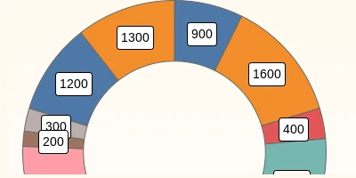
Donut Charts in SharePoint: A Visual Status Indicator
Donut charts serve as a powerful visual aid in representing data proportions while allowing space in the center for additional insights or information. These charts are invaluable in project management and employee management for succinctly displaying status and progress. By integrating donut charts into SharePoint pages, businesses can use these visual status indicators to:
- Quickly assess project completion percentages.
- Monitor resource allocation across different departments.
- Track performance metrics over time.
- Display key performance indicators (KPIs) for team members.
- Show distribution of tasks or workload among employees.
Charting with SharePoint Dashboards
SharePointDashboards.com is a robust platform offering a variety of charting options, including more than 35 different chart types. It provides an easy-to-use, no-code solution that simplifies the process of creating and customizing charts. With user-friendly controls, users can manipulate aspects like borders, background, text styling, and chart legends with ease. This adaptability ensures that businesses can create visualizations that are not only informative but also align with their brand aesthetics.
Using Donut Charts in Project Management
In project management, visual tools like donut charts are essential for keeping stakeholders informed about the project's progress. For instance, project managers can set up a donut chart to illustrate target achievements or milestones. Imagine a scenario where a project comprises multiple phases, each needing precise tracking for timely completion. A donut chart can succinctly summarize progress in each phase, enabling stakeholders to visually grasp areas of concern quickly.
Employee Management and Tracking
Donut charts are equally beneficial in employee management scenarios. They can be used to visualize elements such as skill distribution within teams or the distribution of ongoing projects among employees. Human resources departments can use them to monitor hiring statistics or employee turnover rates.
Simple Integration Using SharePointDashboards.com
One of the standout features of using SharePointDashboards.com is the ease of integrating these charts into SharePoint. After configuring your donut chart using the available options, you can effortlessly copy and paste the chart into your SharePoint list view. This simple process eliminates the need for complex coding or IT support, making it accessible for all users regardless of their technical expertise.
SharePoint JSON Formatting and Custom List Views
SharePoint's robust customization capabilities allow for enhanced display of data, often leveraging JSON formatting. By applying a template to a SharePoint list view, users can create dynamic views that integrate seamlessly with visual elements like charts. JSON formatting in SharePoint assists in achieving personalized data displays, elevating the basic list view to a comprehensive analytics tool. This template application can effortlessly transform any data list into a visual dashboard, further exemplified with SharePointDashboards.com's integration options.
Real-World Use Case Scenarios
Consider a scenario within a sales organization where quarterly sales data needs to be presented. Using a donut chart, sales managers can showcase the percentage of sales achieved against targets for each region, making performance data accessible and understandable at a glance.
Another use case could be in a manufacturing setup where production managers need a visual representation of output versus defect rates. By deploying a donut chart, they can quickly identify production areas that need attention, ensuring quality control measures are promptly executed.
Conclusion
Integrating donut charts into SharePoint pages using SharePointDashboards.com is a no-brainer for businesses seeking to leverage data visualization without cumbersome programming tasks. This tool not only enhances SharePoint's functionality with visual indicators but also provides insights that drive strategic decisions, streamline workflows, and improve overall productivity.
For those intrigued by the possibilities of data visualization in SharePoint,
SharePointDashboards.com offers a comprehensive suite of tools for turning raw data into actionable insights, ensuring that stakeholders remain informed and engaged. Embrace the future of effortless data visualization with donut charts and transform your SharePoint experience today.