Build Visual Bar Charts Using Icons in SharePoint - May 29, 2026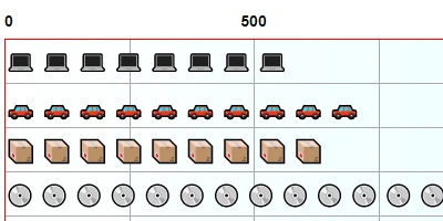
The Versatile Pictogram Chart in SharePoint DashboardsThe realm of data visualization in modern business settings is continually evolving. One of the more innovative yet straightforward tools available to businesses today is the **Pictogram Chart** facilitated by SharePointDashboards.com. This charting solution allows users to transform raw data into engaging visual stories, making use of a variety of icons to represent data values. What sets it apart is its simplicity and flexibility, requiring only three essential fields from your SharePoint list: a label field, a number field, and an icon field. Once these fields are defined, users have a wealth of customization options at their disposal, such as adjusting scale, colors, borders, and spacing, turning complex datasets into comprehensive visual stories.Integration into Charting and Visual Status IndicatorsIncorporating the Pictogram Chart into your data visualization strategy can significantly enhance your capability to convey progress and development within various organizational processes. Used extensively in charting, these visual status indicators are instrumental in distilling complex information into intuitive symbols understood at a glance. With the ability to select from a broad range of icons, it becomes easier to tailor the visuals to suit the specific narratives your data tells. By effortlessly converting numerical data into a series of icons, these charts serve as powerful tools for status visualization and real-time data interpretation.Project Management ApplicationsProject managers constantly seek out tools that help in maintaining project clarity, efficiency, and team cohesion. The Pictogram Chart can be seamlessly integrated into project management workflows, aiding managers in tracking project phases, resource allocation, and deadlines. By representing data like task completion percentages through pictograms, stakeholders gain immediate insight into project status without needing to delve into complex tables or spreadsheets. Furthermore, setting up such charts in SharePoint is cost-effective, often without the need for sophisticated tools like Power BI. This low-cost, high-efficiency solution means projects can be monitored and adjusted in real time, accommodating the dynamic needs of any project-led organization.Employee Management and TrackingIn employee management, understanding and tracking performance, attendance, and other key metrics is fundamental. The Pictogram Chart allows HR professionals and managers to represent various performance metrics across an organization. For instance, employee attendance or performance metrics can be depicted using distinct icons for visual clarity. The choice of icons can reflect the status or performance levels of employees, quickly communicating where attention is needed, identifying high performers, or pinpointing areas for improvement. Such tools enable better communication and provide a data-driven basis for employee evaluation and development.Setting Up with SharePoint DashboardsSharePointDashboards.com provides a comprehensive and user-friendly platform to create these pictogram charts, using simple copy-and-paste templates. This allows companies to sidestep the high costs associated with alternative solutions while still gaining high-quality visual data representation. Anyone within an organization can quickly create visually appealing and informative charts without requiring advanced technical skills.A Dive into SharePoint JSON FormattingAn integral part of setting up these charts in SharePoint is understanding SharePoint JSON formatting. By applying a template to a SharePoint list view, users can create these charts effortlessly. JSON formatting in SharePoint is a powerful way to customize the appearance of list views and forms. By utilizing JSON code, users can alter how fields are displayed and interactive. This formatting capability is pivotal to achieving the precise look and feel desired for your charts, allowing users to maintain a consistent and professional standard throughout their organizational reporting systems.Use Case ScenariosConsider a sales team aiming to track monthly targets. By applying the Pictogram Chart, they can readily compare actual sales against targets, with icons representing sales volumes or achievements. This visual cue speeds up comprehension among team members and managers alike, fostering a proactive sales culture. In another scenario, a manufacturing unit might use the chart to track production stages. Each production stage might be represented by a unique icon denoting its progress level, thus enhancing communication efficiency across different departments. Lastly, educational institutions can also benefit greatly. For example, tracking student performance where each assignment's completion is marked by a specific icon helps educators identify trends in learning and address issues promptly.Concluding ThoughtsThe Pictogram Chart from SharePointDashboards.com offers a set of versatile, user-friendly tools to transform how organizations visualize and interpret data. By leveraging this charting tool within SharePoint, businesses can enhance their data-driven decision-making processes without the substantial costs that accompany other analytics tools. As a simple, cost-effective solution, the Pictogram Chart empowers teams to communicate more effectively, manage projects with greater clarity, and optimize employee performance tracking with unprecedented ease. It is an essential tool for any forward-thinking organization looking to leverage data visualization to its advantage.Watch a video to learn more:
|
