Unlocking the Power of Charting in SharePoint Online
Effectively communicating the status and progress of projects can pose a significant challenge in the digital workplace. While SharePoint Online provides a versatile platform for project and employee management, its native charting capabilities are not robust enough to meet all business needs. Fortunately, SharePointDashboards.com offers a solution that empowers users with more than 35 different charting templates, facilitating a seamless transformation of data into visual insights.
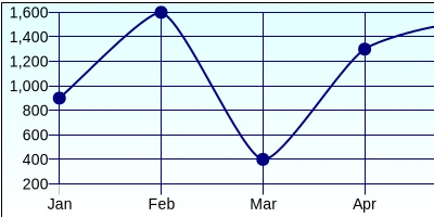
Integrating Charting into Project Management and Tracking
Incorporating visual status indicators and charting into SharePoint Online can enhance project management significantly. Robust charts:
- Provide Intuitive Visuals: Translating data into visual formats like pie charts, line graphs, and bar charts can transform complex data into intuitive visuals, aiding in quicker understanding and decision-making.
- Track Progress: Charts enable project managers to track project milestones, identify bottlenecks, and adjust project timelines effectively.
- Monitor Employee Performance: Visual status indicators ensure that performance metrics are clear, making it easier to manage and motivate teams.
The ability to visualize data helps teams grasp project statuses at a glance, allowing for quicker updates and more informed decisions.
SharePointDashboards.com: The Solution for SharePoint Online
SharePointDashboards.com provides a rich library of over 35 customizable charting templates designed to plug directly into SharePoint sites. This collection is especially valuable because:
- No Software Installation Required: Users can deploy these templates without the need for additional software, simplifying the process.
- Ease of Use: These templates are designed for simplicity, requiring only basic copy and paste actions to set up.
- No Coding Skills Needed: The templates eliminate the need for coding knowledge, making robust charting more accessible to all users.
These templates are versatile and broadly applicable, facilitating detailed data visualization in a matter of minutes.
Setting Up SharePoint Dashboards Using JSON Formatting Templates
The key to the simplicity and utility of these templates lies in JSON (JavaScript Object Notation) formatting. JSON is a lightweight, data-interchange format that is easy to read and write for humans and machines alike. To apply a template, users do the following:
- Select a charting template from SharePointDashboards.com that meets their specific needs.
- Adjust template settings to fit the data visualization requirements.
- Copy and paste the JSON formatted template into a SharePoint list view.
In essence, by applying a simple template to a SharePoint list view, organizations can harness the power of charts to depict data vividly and effectively.
Use Case Scenarios: Enhancing Efficiency and Communication
The integration of advanced charting in SharePoint Online can significantly impact various organizational functions. Here are a few scenarios that demonstrate its utility:
Project Management: A project manager at a tech firm can use Gantt charts to track project timelines, ensuring that complex projects remain on schedule. Monitoring task completions and deadline adjustments becomes more visual and manageable.
Sales Performance Tracking: In sales departments, dashboard templates can be used to visualize KPI metrics, such as lead conversion rates or sales targets. This aids in identifying trends and areas needing improvement.
HR Management: HR teams can benefit by charting employee attendance or performance data, providing richer insights into workforce productivity and morale.
These scenarios illustrate how specific teams within an organization can leverage enhanced charting to improve transparency, productivity, and communication.
Navigating the Charting Options
Exploring the extensive charting options available at SharePointDashboards.com gives users the flexibility needed to find the perfect fit for their projects. The gallery provides detailed examples of each chart type, allowing users to envision how data will be presented visually. For users seeking more information, the gallery of options can be browsed
here.
Ultimately, enhancing SharePoint Online with robust charting capabilities through SharePointDashboards.com not only bridges gaps in data visualization but also augments project management and employee engagement by offering clear, actionable insights. By simplifying the deployment process with JSON formatted templates, the barrier to effective data visualization is lowered, providing an accessible avenue for any organization seeking to optimize its data management strategies.