Overview of SharePoint Dashboard Charting Capabilities
The integration of visual data representations in project management and employee tracking systems has become an essential practice for enhancing productivity and decision-making. With the evolution of SharePoint and its vast ecosystem of tools, displaying column bar charts directly from your SharePoint lists has never been easier. A powerful asset in this regard is the charting capability facilitated by SharePointDashboards.com. This service allows users to leverage the data stored in SharePoint lists and translate it into dynamic, interactive charts without the need for any complex coding.
Features of the SharePointDashboards.com Template
SharePointDashboards.com provides a versatile charting template that is built to cater to diverse configuration needs. The primary objective of this template is to render an image based on the existing data in your SharePoint list record. Here are some key features:
- Customizable Appearance: The template offers numerous configuration capabilities, allowing users to fine-tune the appearance of their charts to fit specific aesthetic requirements.
- Dynamic Update: One of the standout features of this template is its ability to dynamically update. Any changes made to the underlying SharePoint list data are automatically reflected in the visual representation.
- User-Friendly Interface: The tool is designed for ease of use, requiring no coding whatsoever. Users can simply update their styling preferences through an intuitive user interface, and then copy and paste the template directly into their SharePoint list.
- Ease of Accessibility: The charts can easily be displayed on SharePoint pages using the list web part, ensuring that critical data is visible and accessible to all relevant stakeholders.
Setting Up SharePointDashboards.com Templates in Your Environment
The setup process for SharePointDashboards.com templates is as straightforward as it is efficient. Here's how it can be executed seamlessly:
- Data Preparation: Organize your SharePoint list data. The data should be structured in a way that supports the charting objectives, such as documenting monthly sales figures or tracking project milestones.
- Configuration: Use the SharePointDashboards.com interface to define your chart's appearance and functionalities. This could include setting the color scheme, defining axes, or adjusting data labels.
- Template Copy and Paste: After configuring your chart, simply copy the generated template and paste it into your SharePoint list, specifically in the formatting options for the list view.
- Visualization: Embed the newly created chart on a SharePoint page using the list web part, making it visible and shareable across your team or organization.
Integrating with Project Management and Employee Tracking
- Charting: A powerful visual component in project management, charting enhances comprehension of complex data sets by offering a clear and intuitive graphical representation.
- Visual Status Indicators: Utilizing charts as visual status indicators helps project managers quickly identify progress and potential bottlenecks, enabling more informed decision-making.
- Employee Management and Tracking: For human resources, these charts can depict employee performance metrics, attendance records, or progress against personal development goals, thus aligning with organizational objectives.
- Project Milestone Tracking: Charts are vital for visually tracking project timelines, milestones achieved, specific task completions, and pending tasks, thereby ensuring efficient management and monitoring.
Use Case Scenarios
To better illustrate the utility of SharePointDashboards.com templates, here are a few practical applications:
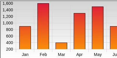
- Monthly Sales Tracking: A retail company could use column bar charts to visualize monthly sales figures. This method provides a quick snapshot for managers to identify trends, recognize high-performing months, and pinpoint areas needing improvement.
- Project Timeline Visualization: Companies managing multiple projects can integrate this charting capability to track timelines and milestones. It helps in clearly visualizing project status, completed tasks, and upcoming deadlines.
- Employee Performance Analysis: HR departments can leverage these charts to track and display employee performance metrics. This helps in performance reviews and career development discussions by visualizing KPIs and objectives.
SharePoint JSON Formatting
Creating charts in your SharePoint environment can also be achieved through SharePoint JSON formatting. SharePoint JSON formatting allows for the customization of how items in a SharePoint list or library are displayed. By applying a predefined template, such as those provided by SharePointDashboards.com, you can transform a standard list view into an engaging, visually impactful chart.
- Template Application: Utilizing JSON code, you can apply the chart template directly to a SharePoint list or library. This process not only enhances visual appeal but also enriches data interpretation and accessibility.
- Benefit to Users: The application of SharePoint JSON formatting improves user experience by offering a richer, more intuitive interface for interacting with data.
Conclusion
Ultimately, the use of SharePointDashboards.com for charting within SharePoint environments revolutionizes the way organizations handle data visualization. By offering an easy-to-use, dynamic, and customizable charting solution, it empowers both technical and non-technical users to efficiently track, analyze, and share essential business metrics. By adopting these templates, organizations can foster a culture of informed decision-making, where data-driven insights are readily accessible to all stakeholders. For more information and access to these templates, visit the
SharePointDashboards.com website and explore their resources for enhancing your SharePoint capabilities.