Introduction
Date and time fields are essential components in SharePoint lists, serving as pivotal data points for tracking and managing information across various projects and tasks. While SharePoint is a powerful tool for storing and organizing information, its native ability to visually represent differences between two date time fields can be limited. Fortunately, there are solutions like SharePointDashboards.com that offer user-friendly templates to showcase these differences effectively. In this article, we will delve into how these templates can enhance charting, provide visual status indicators, and contribute to effective project management and employee tracking.
Enhancing Charting with Date Time Fields
Charting is a vital component of data analysis, allowing stakeholders to visualize data trends over time. When tracking project progress, analyzing the difference between initial and current dates can reveal critical insights into project timelines, deadlines, and performance. By using templates from SharePointDashboards.com, users can choose from a plethora of date time formatting options to present data in a visually interpretable manner. This enhances the ability to quickly understand and address any deviations in project schedules.
Visual Status Indicators
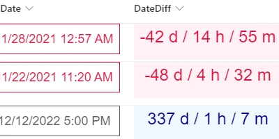
Project management relies heavily on understanding the current status of tasks at a glance. Visual status indicators serve this purpose by using color-coded displays, borders, and font styles. The Date Difference formatting template from SharePointDashboards.com enables users to craft these indicators effortlessly. With options to customize colors and styles, teams can set specific visual cues for when deadlines are approaching or have passed, thereby facilitating proactive management.
Project Management and Employee Tracking
In the realm of project management, tracking project deadlines and employee task completion is crucial. SharePoint lists are extensively used for maintaining project data, but the need to see how far or near tasks are from their due dates is critical for managers. By implementing the date difference display template, project managers can immediately identify tasks falling behind schedule, allowing them to allocate resources efficiently and balance workloads among employees.
Setting Up Date Time Difference on SharePoint
Setting up a Date Time Difference view in SharePoint is straightforward, thanks to the templates available at SharePointDashboards.com. Users simply select the desired format from a range of options, set styling preferences such as colors, borders, and font styles, and then apply these settings through a basic copy-and-paste template. By pasting this ready-made template into their SharePoint list, users can instantly transform how date differences are displayed in their list views, thereby enhancing their data visualization capabilities.
Use Case Scenarios
To better understand the application of these templates, consider some scenarios:
- In a project management setting, a manager overseeing multiple project deadlines can set up a date difference visualization to color-code tasks based on urgency - green for on track, yellow for warning, and red for overdue.
- For HR departments tracking employee leave requests, a date difference indicator can be used to highlight when employees are set to return from leave, allowing proactive scheduling and workload distribution.
- In IT management, where software deployment schedules are frequent, teams can use date differences to track deployment cycles against planned schedules, ensuring timely releases and stakeholder communication.
SharePoint JSON Formatting
SharePoint JSON formatting is a powerful method to customize list views beyond standard configurations. By applying a JSON template to a SharePoint list view, users can control how information is presented without extensive coding knowledge. SharePointDashboards.com offers numerous templates that can be seamlessly applied, allowing even novice users to create professional and effective data presentations. The Date Difference formatting template uses JSON to compute the interval between two date time fields, applying user-defined styles to emphasize these differences effectively.
Conclusion
By using tools and templates available at SharePointDashboards.com, businesses can significantly improve their data visualization and project management efficiencies in SharePoint. Whether it is for charting purposes, providing visual status indicators, or managing employees and projects, showing differences between date time fields has never been easier. The ability to adjust formatting options according to project needs ensures that teams have customizable solutions that can be widely applied across various business functions. Ultimately, leveraging these versatile date time difference templates enhances the clarity and effectiveness of data sharing and decision-making processes.