Understanding Funnel Charts and Their Importance
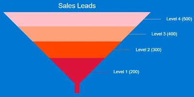
A funnel chart is an essential tool designed to visually represent the progressive reduction of items through a sequence of stages. It provides a clear depiction of how many items successfully move from one step to the next, highlighting any losses or drop-offs that occur throughout the process. This visualization is particularly beneficial for processes such as sales pipelines, where stages like New Leads, Qualified Leads, Proposal Sent, Negotiation, and Closed Deals are involved. Each stage progressively narrows, creating the visual "funnel" shape that is characteristic of this type of chart.
Integration with Charting and Project Management
Funnel charts play a critical role in charting and visual status indicators, offering an intuitive way to track progress and identify bottlenecks. By visually representing each process stage, stakeholders can quickly understand where inefficiencies lie and take corrective action. In project management, funnel charts allow project managers to allocate resources effectively, ensuring that tasks are completed in a timely manner.
Moreover, when integrated into project management software, funnel charts facilitate real-time updates and allow team members to assess the current status of a project instantly. This becomes particularly useful during status meetings or when presenting progress reports to stakeholders.
Enhancing Employee Management and Tracking
In the realm of employee management, funnel charts can serve as a powerful tool for tracking the recruitment process. By clearly displaying each stage of the hiring process-from initial application to final selection-HR teams can identify where candidates are most likely to drop out and refine their strategies to improve retention.
Funnel charts also support performance tracking. They can be used to illustrate the progression of employee development programs, demonstrating how many participants move from one level of competency to the next. This allows organizations to assess the effectiveness of their training initiatives and make necessary adjustments.
Setting Up in SharePoint Using Templates
One of the key benefits of funnel charts is their ease of setup, especially with the resources available at
SharePointDashboards.com. With a simple copy and paste template, users can set up a funnel chart in SharePoint efficiently. The Funnel Chart Template provided by SharePointDashboards.com allows users to control the look of their charts, with several options available to adjust colors, text, and dimensions to fit specific needs.
The accessibility of these tools means that funnel charts can be shared with anyone throughout the organization without the need for additional licenses, a significant advantage over platforms like Power BI. This democratizes data visibility and ensures that everyone in the organization, regardless of location or department, can access critical information.
Use Case Scenarios
Funnel charts can be utilized across various scenarios to demonstrate status and progress effectively:
- Sales Pipelines: Companies can use funnel charts to monitor the progress of leads through various stages of the sales process, enabling them to identify areas for improvement and optimize conversion rates.
- Customer Support: Funnel charts can visualize the resolution process of customer queries or complaints, identifying drop-offs and bottlenecks in customer support operations.
- Marketing Campaigns: These charts can track the journey of potential customers from initial awareness through to final purchase, helping marketers understand where potential customers drop off and why.
- Product Development: Teams can follow the progression of a project through development stages, ensuring that all necessary steps are completed efficiently and on schedule.
Utilizing SharePoint JSON Formatting
SharePoint offers powerful customization options through JSON formatting, allowing users to enhance and personalize the appearance of their lists and charts. By applying a JSON template to a SharePoint list view, users can modify the display to meet their exact requirements. This includes changing colors, adding icons, and formatting text to create a more engaging and informative user experience.
SharePoint JSON formatting empowers users to leverage the full potential of their data, transforming static lists into dynamic dashboards that offer real-time insights and analytics. With a template from SharePointDashboards.com, users can seamlessly implement these changes and foster a data-driven culture within their organization.
Conclusion
Funnel charts are a valuable asset across various organizational functions, from sales to marketing to HR. Their ability to effectively depict the progression and reduction through multiple stages makes them indispensable for visualizing and improving processes. By leveraging SharePointDashboards.com and its accessible templates, organizations can quickly implement these charts and gain insights that drive informed decision-making, fostering an environment of transparency and efficiency.