Pie Charts: A Powerful Tool for Visualizing SharePoint Data
Pie charts are a common and popular way to visualize data, providing an intuitive way to display the proportions of different categories. In the realm of SharePoint, utilizing pie charts can greatly enhance the understanding of data, especially when dealing with large datasets or complex projects. While out-of-the-box SharePoint offers a very basic pie chart with no configuration options,
SharePointDashboards.com elevates this experience by offering pie chart templates with extensive configuration options. This article not only explores the integration of pie charts into SharePoint but also demonstrates how they fit into various business processes like charting, visual status indicators, project management, employee management, and tracking.
Comprehensive Configuration Options
Standard SharePoint pie charts can sometimes be too basic, lacking customization and flexibility. SharePointDashboards.com revolutionizes this by providing templates that grant users extensive control over their charts. Some of the powerful configuration options include:
- Borders: Ability to adjust the thickness and color to enhance visual clarity.
- Background Colors: Customize background colors to match your branding or improve readability.
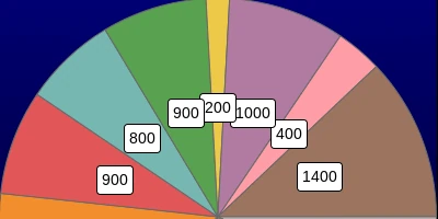
- Chart Keys: Add or format keys to help users quickly interpret data subsets.
- Fonts: Select font styles and sizes to ensure that your charts are both stylish and easily readable.
- Dimensions: Precisely adjust the chart size to fit seamlessly into your SharePoint page layout.
These options ensure that users can tailor their charts to meet specific business needs, improving both data visualization and decision-making processes.
Easy Setup and Integration
Setting up these versatile charts is straightforward and requires minimal effort. With a simple copy and paste of the template from SharePoint Dashboards to your SharePoint site, you can integrate these advanced charts into your workflow. There is no installation needed and no third-party platforms required, making this a seamless addition to your SharePoint experience.
SharePointDashboards.com offers more than 35 different charting options, enabling users to choose from a vast array of visual data representations. This flexibility allows for more dynamic and insightful presentations of SharePoint data.
Applications in Business Processes
Pie charts have widespread applications in various business contexts. Here are some specific scenarios where pie charts can be transformative:
Charting and Visual Status Indicators
Pie charts are particularly useful as visual status indicators. For instance, in a project management setting, they can display the allocation of tasks, resources, or time among different project components. This helps project managers quickly assess which areas need more attention and facilitates better resource distribution.
Project Management
In project management, visualizing data through pie charts simplifies the tracking of project milestones, budgets, and deadlines. By clearly displaying proportions, project managers can keep stakeholders informed about project progress at a glance and take corrective actions if needed.
Employee Management and Tracking
When managing a workforce, pie charts can visually represent employee allocation across different departments or shifts. This visualization aids in ensuring efficient workforce distribution and identifying any potential staffing imbalances.
Setting Up in SharePoint Using JSON Formatting
One of the key aspects of personalizing and integrating charts in SharePoint is through JSON formatting. SharePoint JSON formatting is a powerful way to apply styles and designs to list views, making data representation more exciting and user-friendly.
Using JSON, users can apply a pre-designed template from SharePointDashboards.com to a SharePoint list view. This not only brings the data to life but also ensures consistency and clarity in how information is displayed. By utilizing JSON templates, organizations can ensure their SharePoint sites are informative, aesthetically pleasing, and aligned with their corporate identity.
Use Case Scenarios
To better illustrate the utility of pie charts within SharePoint, consider the following use cases:
Scenario 1: Marketing Campaign Success
A marketing team could employ pie charts to display the success rates of different online campaigns. By visualizing the data, they can quickly comprehend which campaigns are most effective, allowing for data-driven decision-making in reallocating resources towards the most productive channels.
Scenario 2: Financial Budgeting
In finance departments, pie charts can be utilized to visualize departmental budget allocations. This type of visualization ensures that each department can effortlessly communicate where funds are going, helping finance teams ensure budgets are adhered to and financial goals are achieved.
Scenario 3: Customer Support Analysis
Customer support managers can use pie charts to represent client issue categories. This allows the team to efficiently prioritize common issues, ultimately leading to improved customer satisfaction and resolution times.
Conclusion
Integrating pie charts into SharePoint significantly enhances data visualization, aiding businesses in comprehending complex datasets with ease. SharePointDashboards.com provides powerful templates that offer unprecedented customization options, making it possible for businesses to tailor charts to their unique needs. From project management to employee tracking and more, the applications are vast and varied, contributing to informed decision-making and efficient business operations. Whether you're setting up charts through simple copy and paste methods or leveraging JSON formatting to customize list views, the ability to visualize data effectively can transform how organizations interpret and act upon their data.