Introduction
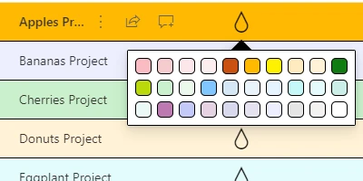
SharePoint lists, utilized widely within organizations for efficient data management and collaboration, often appear mundane when leveraged with default settings. The absence of visual cues can make it challenging for users to quickly decipher critical information from a large volume of data. This is where the Background Color Picker template from
SharePointDashboards.com becomes invaluable. This feature provides an easy method to enhance SharePoint lists by applying background colors to entire rows, thereby elevating both the aesthetic appeal and functional clarity of list data.
Enhancing Data Visualization in SharePoint
Visual cues are crucial in data management and analysis, as they enable quick comprehension and decision-making. By highlighting SharePoint list rows with background colors, users can efficiently identify and prioritize information. The Background Color Picker template is a user-friendly tool that allows users to apply colors such as yellow for critical records and green for completed records. This customization facilitates a better understanding of data, making it more accessible and actionable.
Integration with Charting and Visual Status Indicators
The use of color-coded rows extends beyond mere aesthetics to integrate seamlessly with charting and visual status indicators. Colored rows can serve as a visual cue for data that requires attention or aligns with specific project milestones. This approach can be leveraged within project management and employee tracking systems to immediately convey the status of various tasks or initiatives. For instance, stakeholders can quickly assess project health, identify bottlenecks, and recognize achievements in real-time.
Application in Project Management
Project management often involves keeping track of numerous moving parts, deadlines, and team responsibilities. The ability to visually prioritize tasks using colored SharePoint lists can significantly aid in better management and tracking of project progress. This color coding can be used to:
- Highlight overdue tasks, allowing project managers to allocate resources more effectively.
- Identify completed tasks, improving team morale and helping to visualize project progress.
- Flag pending approvals, ensuring stakeholders are aware of items that require their attention.
These visual indicators enhance communication among team members and stakeholders, providing a clear representation of current statuses and priorities.
Enhancing Employee Management and Tracking
Employee management and tracking can also benefit greatly from this method of visual data presentation. In environments where teams handle multiple tasks, such as HR departments or operations teams, color-coded rows allow for easy identification of:
- Employee attendance and leave requests.
- Performance metrics and review schedules.
- Training completion and development milestones.
The utilization of such visual indicators in SharePoint lists effectively streamlines data handling, making management processes more efficient.
Setting Up in SharePoint with SharePointDashboards.com
One of the key advantages of using the Background Color Picker template is its simplicity in implementation. Accessible at
SharePointDashboards.com, the template requires nothing more than a simple copy and paste into your SharePoint list. This ease of setup allows even novice users to enhance their SharePoint experience without extensive technical knowledge. New users are encouraged to sign up to gain access to 21 free templates, thereby easing their exploration into data visualization.
Use Case Scenarios
Consider a scenario in a marketing department where each campaign needs to be tracked from initiation to completion. By using colored rows:
- Campaigns approaching deadlines could be marked in red, prompting urgent action.
- Campaigns awaiting client feedback could be highlighted in orange.
- Successful campaigns that meet objectives could be highlighted in blue.
Such status and progress indicators make the dataset intuitive and actionable, allowing for real-time managerial insights.
SharePoint JSON Formatting
A significant feature of enhancing SharePoint lists lies within JSON formatting. This allows users to apply formatting rules to SharePoint list views, efficiently converting raw data into visually appealing and informative layouts. The application of a template from SharePointDashboards.com empowers users to effortlessly apply consistent JSON formats, transforming bland datasets into dynamic information hubs. JSON formatting is especially useful for organizations aiming to maintain a uniform appearance across multiple data repositories.
Conclusion
Ultimately, the potential to highlight SharePoint list rows through the Background Color Picker template at SharePointDashboards.com offers an essential evolution in data processing and management. The practice of applying color-coded indicators transforms SharePoint lists into vibrant, user-friendly resources. Whether utilized in charting, project management, employee tracking, or beyond, these enhancements promote efficiency and intelligibility, leading to better decision-making and overall understanding.