Introduction to Bar Charts in SharePoint
Bar charts are an excellent way to visually represent data trends, especially when dealing with SharePoint data. These charts allow users to easily discern patterns, compare datasets, and convey insights succinctly. However, the out-of-the-box SharePoint experience does not offer robust charting capabilities. Fortunately, SharePointDashboards.com provides a solution with its simple, yet powerful chart templates that integrate seamlessly with SharePoint lists.
The Flexibility of SharePointDashboards.com Chart Templates
SharePointDashboards.com offers a comprehensive selection of over 35 charting templates, making it easy to find the perfect chart format for any need. Whether you're looking to visualize sales data, project progress, or employee performance metrics, the platform's templates provide a visually engaging solution.
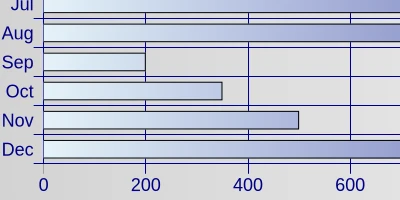
Horizontal charting templates, in particular, are popular for displaying aggregated values, such as total sales by months. These charts allow users to customize and fine-tune settings to achieve the exact appearance they desire, offering a tailored data visualization experience.
Once the chart is configured, users can simply copy and paste the template into a SharePoint list view, making the process straightforward and accessible, even for those with limited technical expertise. With SharePointDashboards.com, charting in SharePoint is not only possible but incredibly easy.
Integration with Project Management
The ability to visualize data trends effectively is crucial for project management. Bar charts help project managers track progress, identify bottlenecks, and allocate resources efficiently. With SharePointDashboards.com's templates, users can:
- Monitor project timelines and visualize task completion rates.
- Track budget expenditures by project phase.
- Assess resource allocation and utilization.
By integrating chart templates into SharePoint, project managers can maintain a dynamic oversight of their projects, ensuring timely adjustments and strategic decision-making.
Enhancing Employee Management
Employee management and tracking is another area where bar charts can provide significant value. Charts can visually represent key performance indicators (KPIs), attendance, and employee engagement metrics. SharePointDashboards.com charts can empower HR managers to:
- Analyze attendance and leave trends.
- Visualize employee performance metrics over time.
- Track employee engagement through survey responses.
With the data-driven insights gained from these visual tools, HR managers can make informed decisions to improve workplace productivity and employee satisfaction.
Visual Status Indicators
Visual status indicators, like those created through bar charts, provide immediate feedback on the status of various tasks or projects. These visual cues are helpful for team leads and stakeholders who want quick updates without delving into detailed reports. With the templates from SharePointDashboards.com, users can:
- Display task completion rates in real time.
- Highlight areas that are on track or at risk.
- Demonstrate monthly performance outcomes visually.
These visual indicators ensure everyone is aligned with the project's current status and can respond proactively to any issues.
Setting Up Charts in SharePoint
Setting up these charts in SharePoint is made simple through SharePointDashboards.com's copy-and-paste template functionality. Users start by choosing their desired template, customizing it to meet their specific needs, and then inserting it into the SharePoint list view. This approach effectively turns static data into dynamic and interactive visual content.
SharePoint JSON Formatting
Another crucial aspect of creating charts in SharePoint is understanding JSON formatting. JSON (JavaScript Object Notation) is a lightweight data-interchange format that's easy to read and write. Within SharePoint, JSON is used to format list views, transforming basic data into complex and informative visuals.
Applying a SharePointDashboards.com template involves embedding JSON code into the SharePoint list view settings. By doing so, users leverage the power of JSON formatting to dictate how data is represented visually, offering an enhanced viewing experience without the need for extensive coding knowledge.
Use Case Scenarios
To illustrate the potential applications of bar charts in SharePoint, consider the following scenarios:
Sales Performance Tracking:
A sales team manager wishes to track monthly sales data to identify trends and forecast future figures. By using a horizontal chart template from SharePointDashboards.com, the manager can quickly visualize sales performance, compare it against targets, and adjust strategies accordingly.
Project Timeline Monitoring:
A project team needs to keep track of various tasks associated with a complex project. By incorporating visual status indicators and bar charts, team members can quickly gauge which tasks are on schedule and which require immediate attention.
Employee Engagement Analysis:
An HR department seeks to understand employee engagement levels across different departments. A bar chart helps to visualize survey results over time, allowing HR to identify areas needing intervention and track the success of engagement initiatives.
Conclusion
Incorporating bar charts into SharePoint allows organizations to transform their data into powerful visual narratives. SharePointDashboards.com's templates make it easy to bypass the limitations of standard SharePoint functionality, offering a user-friendly solution to data visualization needs. Whether for project management, employee tracking, or any other application, these dynamic charts provide clarity and insight, enabling informed decisions and fostering organizational success.