Marimekko Chart for SharePoint: A Comprehensive Guide
The Marimekko Chart, also known as the Mekko chart, is an innovative and dynamic visualization tool available for SharePoint, especially through SharePointDashboards.com. This chart serves as a robust method for displaying complex data sets in a single, comprehensive view. The Marimekko chart combines elements of stacked bar charts and bubble charts to depict two dimensions of magnitude simultaneously. This unique feature makes it an invaluable asset in various professional applications, including charting, visual status indicators, project management, employee management, and tracking.
Understanding the Marimekko Chart
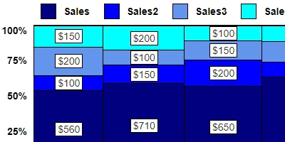
The Marimekko chart is structured uniquely to show data across two distinct variables. Here's how it works:
- The width of each column represents one variable.
- The height of the segments within a column indicates percentages or composition.
- The overall area of each block reflects total contribution.
This configuration enables users to understand market structure, portfolio composition, resource allocation, or category dominance in a single glance. The visualization is especially effective for comparing the relative size of market segments and analyzing how these segments measure up against one another.
Integration with SharePoint
One of the significant advantages of the Marimekko chart is its seamless integration with SharePoint. For organizations utilizing SharePoint as their primary project management and collaboration platform, integrating a Marimekko chart can drastically enhance data interpretation and reporting capabilities.
Setting up a Marimekko chart in SharePoint is straightforward. Users can visit
SharePointDashboards.com to access a simple copy-and-paste template. This ease of set-up ensures that team members of varying technical proficiencies can implement the chart without extensive training.
Use Cases for Marimekko Charts
The adaptability of the Marimekko chart makes it suitable for various use cases across different sectors:
- Market Analysis: Businesses can use the chart to assess market share distribution among competitors and identify which product lines dominate particular segments.
- Resource Allocation: Project managers can visualize how resources are distributed across projects or departments, aiding in more informed decision-making.
- Portfolio Management: Investment firms can employ the Marimekko chart to portray portfolio composition by asset class, sector, or geographical distribution.
- Sales Performance: Sales teams can utilize the chart to breakdown sales figures across different regions and product categories, providing insights into areas of strength and potential growth.
Marimekko Charts as Visual Status Indicators
In project management, visual status indicators are vital in communicating project health and progress effectively. The Marimekko chart, with its ability to juxtapose multiple data dimensions, serves as an excellent visual status indicator. It can represent project timelines, resource allocation, project budgets, and deliverables in a single visualization, eliminating the need for multiple disparate charts.
Employee Management and Tracking
For human resource departments, the Marimekko chart can be a valuable tool for tracking employee distribution across various departments, roles, or skill levels. This can assist in identifying potential skill gaps or areas where additional recruitment may be necessary. Additionally, trends in employee demographics or employment statuses can be easily visualized over time.
Utilizing SharePoint JSON Formatting
A notable feature of SharePoint is its flexibility with JSON formatting, which allows users to customize how data is displayed within SharePoint lists. By applying a template from sites like SharePointDashboards.com, users can leverage JSON to format their SharePoint list view into a Marimekko chart effortlessly.
JSON formatting involves transforming SharePoint data into a structured format that the Marimekko chart will interpret and display. This process can be achieved with a predefined template, thus eliminating the need for advanced coding skills. The end result is a dynamic and interactive chart that aligns seamlessly with the existing SharePoint environment.
Conclusion
The Marimekko chart is an invaluable tool for organizations seeking to enhance their data visualization and interpret complex data sets effectively. Its ability to present two dimensions of data in one cohesive view makes it indispensable in various professional contexts, from market analysis to resource allocation. By integrating this chart into SharePoint with the help of SharePointDashboards.com, organizations can benefit from streamlined data processes and improved project management and decision-making capabilities. The incorporation of JSON formatting further enhances the chart's versatility, making it a must-have for data-driven decision-making in today's fast-paced business environment.