Pyramid Chart for SharePoint Lists - June 2, 2026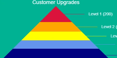
Understanding Pyramid ChartsA pyramid chart is a powerful visualization tool that is used to convey data structured in hierarchical or proportional layers. This chart type is characterized by its unique shape, typically structured with the largest data values at the bottom and progressively smaller segments as you move toward the top. These charts are particularly effective for displaying data that illustrate how quantities decrease as you ascend through various stages, categories, or organizational levels. The pyramid chart is an ideal tool for showcasing relative size or hierarchy within data sets.Difference between Pyramid and Funnel ChartsWhile pyramid charts emphasize the relative size or hierarchy among categories, funnel charts, though visually similar, are more focused on illustrating the flow or reduction of items through various stages of a process. Funnel charts are commonly used in sales processes to depict the conversion rates from leads to actual sales. In contrast, pyramid charts might be used to show the hierarchical structure of an organization or the proportional representation of survey data.Setting Up Pyramid Charts in SharePointCreating a pyramid chart in SharePoint is straightforward, especially with resources available at SharePointDashboards.com. By utilizing their Pyramid Chart Template, users can save time and effort, as setting up the chart requires only a few field configurations. The entire setup process can be completed within minutes, thanks to user-friendly tutorials that guide you through each step. To implement the pyramid chart in SharePoint, users can copy and paste a simple template, allowing quick deployment. This approach is efficient because it leverages existing SharePoint infrastructure without needing extensive modifications or external software. This seamless integration into SharePoint enhances project management, employee management, and overall organizational tracking.Pyramid Charts in Project ManagementIn project management, pyramid charts can be utilized to display the workforce structure or to manage resources effectively. For instance, a project manager can use a pyramid chart to show how the number of personnel decreases as you move from a wide base of junior team members to a narrow top with senior management. This visualization aids in understanding and establishing an efficient chain of command and resource allocation. Such charts can also help in visualizing task distribution and progress, enabling project leaders to identify where there might be bottlenecks or capacity issues. Moreover, pyramid charts can be instrumental in illustrating the steps needed in project completion, from planning to execution, emphasizing the shrinking stages in work processes.Pyramid Charts in Employee ManagementPyramid charts are valuable in employee management scenarios. They can be used to represent the organizational hierarchy, showing the number of employees at each level of the organization. This visualization helps HR departments to assess workforce distribution, identify gaps in the hierarchy, and make informed decisions regarding recruitment, training, and development. Additionally, pyramid charts can depict the distribution of employee expertise levels within a department, providing insights into how skills are spread across the organization and where development programs may be necessary.Pyramid Charts for Tracking ProgressTracking progress across different stages of a project or organizational change initiative can benefit significantly from the use of pyramid charts. By leveraging this visualization method, managers can provide stakeholders with a clear view of progress across various stages, highlighting areas that require more attention or resources. In scenarios where projects have multiple phases-such as research, development, testing, and deployment-a pyramid chart can effectively show phase completion rates visually. This level of insight keeps stakeholders informed and engaged while providing a quick reference for project status.Leveraging SharePoint JSON FormattingSharePoint JSON formatting is a powerful feature that allows for the customization of list views. By applying a template to a SharePoint list view, users can transform standard data presentations into visually appealing and informative charts, such as pyramid charts. The JSON format allows users to specify how the data should be displayed by defining formatting rules within the SharePoint environment. Through a simple JSON script, users can enhance the data visualization capabilities of SharePoint lists, making the information more accessible and engaging to all stakeholders.Use Case Scenarios for Pyramid Charts1. **Sales and Marketing**: In a sales and marketing environment, pyramid charts can be used to illustrate the customer journey. From initial contact, interest, decision, to action, the visualization helps teams to understand how prospects progress through the sales funnel and where attention might be needed to improve conversions. 2. **Educational Institutions**: Educational institutions can use pyramid charts to represent the progression of students across different grade levels. This can provide insights into student advancement and highlight areas where educational interventions might be necessary. 3. **Healthcare Management**: In healthcare settings, pyramid charts can depict patient progress throughout treatment stages. This can be particularly useful for tracking treatments in rehabilitation programs where there is a need to demonstrate the transition from one stage of treatment to the next.ConclusionPyramid charts offer an effective visualization method for presenting hierarchical or proportional data. Whether used in project management, employee management, or tracking progress, these charts provide clarity and insights, allowing for well-informed decision-making. SharePoint makes the implementation of pyramid charts convenient and accessible through simple template applications and JSON formatting, which transforms standard data views into meaningful visual stories. By utilizing resources like SharePointDashboards.com, organizations can effectively leverage pyramid charts to enhance their data presentation and strategic planning efforts.Watch a video to learn more:
|
