Enhancing SharePoint List Views with Visual Indicators
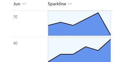
Visual indicators have the power to significantly enhance SharePoint list views by offering a clear and immediate understanding of data trends and progress. Often, the ability to visualize how numbers change over time can provide invaluable insights for businesses and project teams. The Sparkline template available at
SharePointDashboards.com is a powerful tool that allows users to incorporate miniature line charts directly into their SharePoint list views. This article explores the practical applications and benefits of using such visual enhancements, as well as how they integrate into broader project and employee management frameworks.
The Role of Visual Indicators in Charting and Project Management
Visual indicators play a crucial role in charting and project management. By converting raw data into visual formats, stakeholders can more easily interpret trends, progress, and potential issues. In the context of SharePoint, these indicators serve multiple purposes:
- Improved Clarity: Small line charts, or sparklines, embedded in list views provide a quick snapshot of data over time, helping users identify trends and patterns instantly.
- Quick Status Updates: Visual indicators allow teams to receive immediate updates on project statuses without sifting through raw data.
- Enhanced Decision Making: By visualizing progress, project managers and team leads are better equipped to make informed decisions swiftly.
By incorporating visual elements like sparklines, SharePoint users can greatly enhance their data interpretation capabilities, making them invaluable for any project management scenario.
Setting Up Sparklines in SharePoint
Implementing sparklines in a SharePoint list is straightforward, thanks to the simple setup process provided by SharePoint Dashboards. Users need to:
- Select the number fields from their SharePoint list that they wish to visualize.
- Customize the appearance of the sparkline by adjusting colors and dimensions to best fit the SharePoint page.
- Apply the template with a simple copy and paste action into the designated SharePoint list.
This ease of use makes it accessible for users without technical expertise to enhance their SharePoint lists with dynamic visualizations. With more than 35 charting options available, including sparklines, there's tremendous flexibility in how data can be presented.
Use Case Scenarios
Sparklines and other visual indicators have a wide range of applications in various business scenarios:
- Performance Tracking: Organizations can monitor employee performance metrics over time through sparklines, offering a direct visual indication of progress and areas needing improvement.
- Sales and Revenue Analysis: Sales teams can leverage these visual tools to track target achievements, seeing fluctuations in sales figures at a glance and responding accordingly.
- Project Milestones: By integrating sparklines into project management dashboards, teams can track the completion of tasks and milestones, providing stakeholders with an instant overview of project progress.
- Budget Monitoring: Financial managers can use sparklines to monitor budget expenses against forecasts, ensuring better control over financial health.
In each of these instances, the use of visual indicators helps teams focus on critical data, driving efficiency and facilitating more effective management practices.
Understanding SharePoint JSON Formatting
SharePoint JSON formatting is an excellent tool for customizing the appearance and functionality of list views. By applying a JSON template to a SharePoint list view, users can:
- Alter the visual organization of data fields.
- Incorporate color-coding and other visual enhancements.
- Create personalized visualizations suited to specific data presentation needs.
To create these custom views with sparklines, one can apply the JSON template from SharePoint Dashboards to the relevant SharePoint list. This integration allows for heightened personalization and ensures visual data is showcased effectively.
Getting Started with SharePoint Dashboards
New users looking to revolutionize their SharePoint list views can get started by signing up for a trial at SharePoint Dashboards. This trial includes access to 21 templates free of charge, offering a perfect entry point for experimenting with different charting options, including the Sparkline template. By taking advantage of these resources, organizations can unlock the potential visualizing data trends offers, leading to improved decision-making and streamlined project workflows.
In conclusion, the use of visual indicators such as sparklines within SharePoint list views offers a transformative way to manage and interpret data. Accessible through simple implementation processes, these tools empower users to enhance project management, employee tracking, and overall organizational efficiency significantly. Through straightforward integration and effective data presentation, SharePoint Dashboards continues to support businesses in achieving their analytical and operational goals.