Introduction to Line Charts in SharePoint
SharePointDashboards.com offers a versatile line chart option that allows users to seamlessly integrate line charts into SharePoint by utilizing simple copy and paste templates. These line charts are essential for showcasing data trends effectively using SharePoint list data. The process of setting up these templates is straightforward, requiring only adjustments to colors, fonts, borders, and other appearance options to ensure the final product meets your specific aesthetic and functional needs. Once your template is ready, the deployment of the chart into SharePoint is as simple as copying and pasting, making it accessible for all levels of SharePoint users. With options for gradient image transitions and various marker styles, users can create dynamic and visually appealing line charts that enhance the overall presentation of their data.
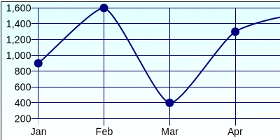
The Importance of Line Charts in Data Visualization
Line charts play a crucial role in data visualization by illustrating trends over time or across different categories, allowing quick insights into patterns and anomalies. Within the realm of project management and employee tracking, line charts can help stakeholders understand progress, identify bottlenecks, and make data-driven decisions. For instance, project managers can utilize line charts to visualize project timelines, track resource allocation, and ensure milestones are met on time. In employee management, line charts can help in tracking performance metrics or monitoring attendance records, thus providing a clear visual representation of the data for better analysis and reporting.
Integration with Charting and Visual Status Indicators
SharePoint users can deploy line charts as visual status indicators within their systems. These charts enhance traditional charting methods by providing an interactive and colorful representation of data trends. This allows users to visualize progress and monitor real-time updates on status dashboards, promoting informed decision-making. The integration of line charts with visual status indicators supports project managers by offering a clear, concise view of various key performance indicators, thereby improving efficiency and productivity.
Use Cases for Line Charts in SharePoint
Line charts in SharePoint can transform how organizations visualize data across various use cases:
- Project Management: Track project progress over time, visualize resource allocation, and analyze timelines for better project planning and execution.
- Employee Performance: Monitor employee output and productivity trends over specified periods to identify high performers or areas needing improvement.
- Financial Reporting: Visualize financial data trends like revenue, expenses, or profit margins to facilitate strategic decision-making.
- Sales and Marketing: Analyze sales growth, market trends, and campaign effectiveness to adjust strategies in real time.
Setting Up Line Charts with SharePointDashboards.com
Setting up line charts via SharePointDashboards.com is designed to be intuitive. Users can begin by selecting a template that best suits their needs from over 35 available options. Customization is key; adjusting colors, fonts, borders, and gradient transitions helps create a chart that is both functional and aesthetically pleasing. Users can apply different marker styles to enhance these visual aspects further. Once customized, deploying the chart onto SharePoint is achieved through a simple copy and paste process. Additionally, these charts can be displayed prominently on SharePoint landing pages through the list web part, ensuring they are accessible and visible to everyone.
Utilizing SharePoint JSON Formatting
SharePoint JSON formatting offers a way to enhance list views by applying visually impactful layouts. JSON formatting is particularly helpful in list views, where users can apply templates to dictate how data is displayed. By utilizing the JSON template provided by SharePointDashboards.com, users can format their SharePoint list views to automatically generate a line chart based on the underlying data. This process leads to better data visualization without the need for deep technical expertise, thereby increasing the accessibility and usability of line charts within SharePoint environments.
The Ease of Use with SharePointDashboards.com Templates
SharePointDashboards.com stands out due to its simplicity and user-friendly approach to data visualization in SharePoint. With their wide variety of charting templates, users have the flexibility to choose and modify their visual tools to meet their precise requirements. The ability to achieve complex visual outcomes through straightforward copy and paste operations ensures that even users with minimal technical background can effectively use these tools. This ease of use extends the utility of SharePoint as a robust platform for not only managing content and collaboration but also for advanced data analytics and presentation.
Conclusion
Choosing SharePointDashboards.com for integrating line charts into SharePoint systems offers a seamless, effective solution for data trend visualization. By allowing for easy customization and quick deployment, these templates empower organizations to enhance their project management, employee tracking, and overall data utilization practices. Incorporating line charts with a straightforward setup process bridges the gap between raw data and intuitive, visually appealing insights, further reinforcing SharePoint's capacity as a comprehensive tool for organizational management and success.