SharePoint JSON List Formatting Training
Check here first before you begin.
You should know:
You should also know:
Before you get started, create your own practice SharePoint site. This is your own dedicated site where you will create and update lists used in training. In each training module, you will make updates to SharePoint lists, write JSON code, then apply it to lists.
All code will work with SharePoint Online and SharePoint Server Subscription (2022+). SharePoint 2019 and ealier is not supported.
Get the most out of JSON coding use these resources.
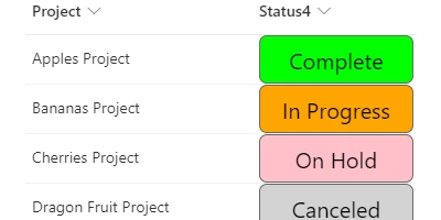
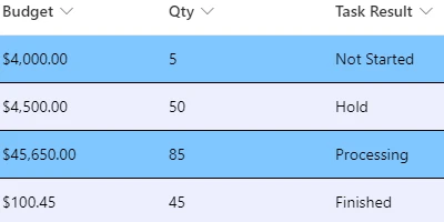
Apply background colors to a choice field according to value.
Fields:
FIELD CONTENT
1. Begin with column formatting schema:
{
  "$schema": "https://developer.microsoft.com/json-schemas/sp/column-formatting.schema.json",
  "elmType": "div"
}
2. Add a child div:
{
  "$schema": "https://developer.microsoft.com/json-schemas/sp/v2/column-formatting.schema.json",
  "elmType": "div",
  "children": [
    {
      "elmType": "div",
      "txtContent": "@currentField",
      "style": {
        "margin": "auto"
      }
    }
  ]
}
3. Use if condition checks to set the background color:
{
  "$schema": "https://developer.microsoft.com/json-schemas/sp/v2/column-formatting.schema.json",
  "elmType": "div",
  "style": {
    "background-color": "=if(@currentField == 'Not Started','cyan','') + if(@currentField == 'In Progress','orange','') + if(@currentField == 'On Hold','pink','') + if(@currentField == 'Canceled','LightGray','') + if(@currentField == 'Complete','lime','')"
  },
  "children": [
    {
      "elmType": "div",
      "txtContent": "@currentField",
      "style": {
        "margin": "auto"
      }
    }
  ]
}
4. Apply additional styles to the parent div:
{
  "$schema": "https://developer.microsoft.com/json-schemas/sp/v2/column-formatting.schema.json",
  "elmType": "div",
  "style": {
    "background-color": "=if(@currentField == 'Not Started','cyan','') + if(@currentField == 'In Progress','orange','') + if(@currentField == 'On Hold','pink','') + if(@currentField == 'Canceled','LightGray','') + if(@currentField == 'Complete','lime','')",
    "color": "black",
    "font-size": "20px",
    "font-family": "arial",
    "border": "1px solid black",
    "border-radius": "7px"
  },
  "children": [
    {
      "elmType": "div",
      "txtContent": "@currentField",
      "style": {
        "margin": "auto"
      }
    }
  ]
}
Enable inline editing for a specific field.
Fields:
FIELD CONTENT
1. Begin with column formatting schema:
{
  "$schema": "https://developer.microsoft.com/json-schemas/sp/column-formatting.schema.json",
  "elmType": "div"
}
2. Add attributes:
{
  "$schema": "https://developer.microsoft.com/json-schemas/sp/column-formatting.schema.json",
  "elmType": "div",
  "inlineEditField": "@currentField",
  "txtContent": "@currentField"
}
3. Add styles:
{
  "$schema": "https://developer.microsoft.com/json-schemas/sp/column-formatting.schema.json",
  "elmType": "div",
  "inlineEditField": "@currentField",
  "txtContent": "@currentField",
  "style": {
    "display": "flex",
    "width": "98%",
    "border": "1px solid transparent",
    "--inline-editor-border-color": "LimeGreen",
    "cursor": "pointer",
    "padding": "11px 0px 11px 2px",
    "margin-left": "0px"
  }
}
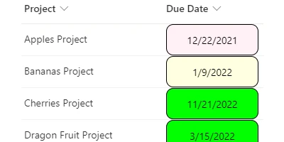
Apply background colors to a date field according to whether date is future, past or today.
Fields:
FIELD CONTENT
1. Begin with column formatting schema:
{
  "$schema": "https://developer.microsoft.com/json-schemas/sp/column-formatting.schema.json",
  "elmType": "div"
}
2. Add a child div:
{
  "$schema": "https://developer.microsoft.com/json-schemas/sp/v2/column-formatting.schema.json",
  "elmType": "div",
  "children": [
    {
      "elmType": "div",
      "txtContent": "@currentField",
      "style": {
        "margin": "auto"
      }
    }
  ]
}
3. Compare the date and change the background color accordingly:
{
  "$schema": "https://developer.microsoft.com/json-schemas/sp/v2/column-formatting.schema.json",
  "elmType": "div",
  "style": {
    "background-color": "=if(toDateString(@now) == toDateString(@currentField),'LightYellow',if(@currentField < @now,'LavenderBlush','Lime'))"
  },
  "children": [
    {
      "elmType": "div",
      "txtContent": "@currentField",
      "style": {
        "margin": "auto"
      }
    }
  ]
}
4. Add additional styles to the parent div:
{
  "$schema": "https://developer.microsoft.com/json-schemas/sp/v2/column-formatting.schema.json",
  "elmType": "div",
  "style": {
    "background-color": "=if(toDateString(@now) == toDateString(@currentField),'LightYellow',if(@currentField < @now,'LavenderBlush','Lime'))",
    "color": "black",
    "font-size": "14px",
    "font-family": "arial",
    "border": "1px solid Black",
    "border-radius": "7px"
  },
  "children": [
    {
      "elmType": "div",
      "txtContent": "@currentField",
      "style": {
        "margin": "auto"
      }
    }
  ]
}
5. Hide the output if there is no date:
{
  "$schema": "https://developer.microsoft.com/json-schemas/sp/v2/column-formatting.schema.json",
  "elmType": "div",
  "style": {
    "background-color": "=if(toDateString(@now) == toDateString(@currentField),'LightYellow',if(@currentField < @now,'LavenderBlush','Lime'))",
    "color": "black",
    "font-size": "14px",
    "font-family": "arial",
    "border": "1px solid Black",
    "border-radius": "7px",
    "display": "=if(@currentField,'flex','none')"
  },
  "children": [
    {
      "elmType": "div",
      "txtContent": "@currentField",
      "style": {
        "margin": "auto"
      }
    }
  ]
}
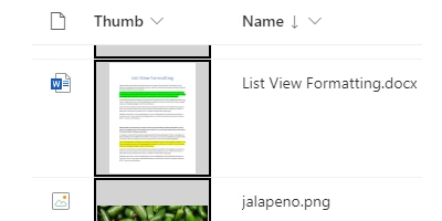
Display a thumbnail preview image for files in a library. Opens file on click.
Fields:
1. Begin with column formatting schema:
{
  "$schema": "https://developer.microsoft.com/json-schemas/sp/column-formatting.schema.json",
  "elmType": "div"
}
2. Add a child button with an image inside:
{
  "$schema": "https://developer.microsoft.com/json-schemas/sp/v2/column-formatting.schema.json",
  "elmType": "div",
  "children": [
    {
      "elmType": "button",
      "children": [
        {
          "elmType": "img"
        }
      ]
    }
  ]
}
3. Add image source attribute and styling:
{
  "$schema": "https://developer.microsoft.com/json-schemas/sp/v2/column-formatting.schema.json",
  "elmType": "div",
  "children": [
    {
      "elmType": "button",
      "children": [
        {
          "elmType": "img",
          "attributes": {
            "src": "@thumbnail.100"
          },
          "style": {
            "display": "inline-block",
            "height": "100%",
            "vertical-align": "middle"
          }
        }
      ]
    }
  ]
}
4. Add a click action to the button and give it a hover border:
{
  "$schema": "https://developer.microsoft.com/json-schemas/sp/v2/column-formatting.schema.json",
  "elmType": "div",
  "children": [
    {
      "elmType": "button",
      "customRowAction": {
        "action": "defaultClick"
      },
      "attributes": {
        "class": "ms-borderColor-black ms-borderColor-greenLight--hover"
      },
      "children": [
        {
          "elmType": "img",
          "attributes": {
            "src": "@thumbnail.100"
          },
          "style": {
            "display": "inline-block",
            "height": "100%",
            "vertical-align": "middle"
          }
        }
      ]
    }
  ]
}
5. Add styling to the button element:
{
  "$schema": "https://developer.microsoft.com/json-schemas/sp/v2/column-formatting.schema.json",
  "elmType": "div",
  "children": [
    {
      "elmType": "button",
      "customRowAction": {
        "action": "defaultClick"
      },
      "attributes": {
        "class": "ms-borderColor-black ms-borderColor-greenLight--hover"
      },
      "style": {
        "overflow": "hidden",
        "cursor": "pointer",
        "padding": "1px",
        "background-color": "lightgray"
      },
      "children": [
        {
          "elmType": "img",
          "attributes": {
            "src": "@thumbnail.100"
          },
          "style": {
            "display": "inline-block",
            "height": "100%",
            "vertical-align": "middle"
          }
        }
      ]
    }
  ]
}
Adjust the background color, borders and font size styling for rows of data.
Fields:
1. Begin with view formatting schema:
{
  "$schema": "https://developer.microsoft.com/json-schemas/sp/view-formatting.schema.json"
}
2. Add additionalRowClass and adjust font size:
{
  "$schema": "https://developer.microsoft.com/json-schemas/sp/view-formatting.schema.json",
  "additionalRowClass": "ms-font-m"
}
3. Set the text color
{
  "$schema": "https://developer.microsoft.com/json-schemas/sp/view-formatting.schema.json",
  "additionalRowClass": "ms-font-m ms-fontColor-black"
}
4. Set the selected row background color:
{
  "$schema": "https://developer.microsoft.com/json-schemas/sp/view-formatting.schema.json",
  "additionalRowClass": "='ms-font-m ms-fontColor-black ' + if(@isSelected,'sp-css-backgroundColor-BgGold','')"
}
5. Set the row background color and alternating row background color:
{
  "$schema": "https://developer.microsoft.com/json-schemas/sp/view-formatting.schema.json",
  "additionalRowClass": "='ms-font-m ms-fontColor-black ' + if(@isSelected,'sp-css-backgroundColor-BgGold',if(@rowIndex % 2 == 0,'sp-css-backgroundColor-BgSage20','sp-css-backgroundColor-BgLightBlue')"
}
6. Set row border color and style:
{
  "$schema": "https://developer.microsoft.com/json-schemas/sp/view-formatting.schema.json",
  "additionalRowClass": "='ms-font-m ms-fontColor-black ' + if(@isSelected,'sp-css-backgroundColor-BgGold',if(@rowIndex % 2 == 0,'sp-css-backgroundColor-BgSage20','sp-css-backgroundColor-BgLightBlue') + ' sp-css-borderBottomColor-DarkBlueText sp-fieldBorderBottomSolid'"
}
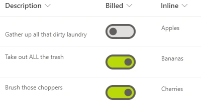
Display a simple toggle button for use with a yes / no field.
Field:
BACKGROUND TOGGLE ELEMENTFOREGROUND TOGGLE ELEMENT
1. Begin with column formatting schema:
{
  "$schema": "https://developer.microsoft.com/json-schemas/sp/column-formatting.schema.json",
  "elmType": "div"
}
2. Add div structure:
{
  "$schema": "https://developer.microsoft.com/json-schemas/sp/column-formatting.schema.json",
  "elmType": "div",
  "style": {
    "display": "flex"
  },
  "children": [
    {
      "elmType": "div"
    },
    {
      "elmType": "div"
    }
  ]
}
3. Add styles:
{
  "$schema": "https://developer.microsoft.com/json-schemas/sp/column-formatting.schema.json",
  "elmType": "div",
  "style": {
    "display": "flex"
  },
  "children": [
    {
      "elmType": "div",
      "style": {
        "font-size": "60px"
      }
    },
    {
      "elmType": "div",
      "style": {
        "cursor": "pointer",
        "font-size": "60px",
        "margin-left": "-60px"
      }
    }
  ]
}
4. Add a custom row action
{
  "$schema": "https://developer.microsoft.com/json-schemas/sp/column-formatting.schema.json",
  "elmType": "div",
  "style": {
    "display": "flex"
  },
  "children": [
    {
      "elmType": "div",
      "style": {
        "font-size": "60px"
      }
    },
    {
      "elmType": "div",
      "style": {
        "cursor": "pointer",
        "font-size": "60px",
        "margin-left": "-60px"
      },
      "customRowAction": {
        "action": "setValue",
        "actionInput": {
          "FIELD REQUIRED": "=if(@currentField,0,1)"
        }
      }
    }
  ]
}
5. Add attributes
{
  "$schema": "https://developer.microsoft.com/json-schemas/sp/column-formatting.schema.json",
  "elmType": "div",
  "style": {
    "display": "flex"
  },
  "children": [
    {
      "elmType": "div",
      "attributes": {
        "iconName": "ToggleFilled",
        "class": "=if(@currentField,'ms-fontColor-greenLight','ms-fontColor-gray40')"
      },
      "style": {
        "font-size": "60px"
      }
    },
    {
      "elmType": "div",
      "attributes": {
        "iconName": "=if(@currentField,'ToggleRight','ToggleLeft')",
        "class": "=if(@currentField,'ms-fontColor-green','ms-fontColor-gray120') + ' ms-fontColor-yellow--hover'"
      },
      "style": {
        "cursor": "pointer",
        "font-size": "60px",
        "margin-left": "-60px"
      },
      "customRowAction": {
        "action": "setValue",
        "actionInput": {
          "FIELD REQUIRED": "=if(@currentField,0,1)"
        }
      }
    }
  ]
}
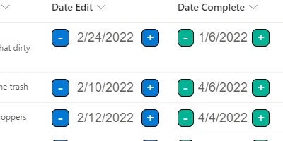
Display an interactive date input field which increment + / - buttons
Field:
DATE INPUT
1. Begin with column formatting schema:
{
  "$schema": "https://developer.microsoft.com/json-schemas/sp/column-formatting.schema.json",
  "elmType": "div"
}
2. Add a div element surrounded by two buttons:
{
  "$schema": "https://developer.microsoft.com/json-schemas/sp/v2/column-formatting.schema.json",
  "elmType": "div",
  "children": [
    {
      "elmType": "button",
      "txtContent": "-"
    },
    {
      "elmType": "div",
      "txtContent": "@currentField"
    },
    {
      "elmType": "button",
      "txtContent": "+"
    }
  ]
}
3. Add button actions and enable inline edit:
{
  "$schema": "https://developer.microsoft.com/json-schemas/sp/v2/column-formatting.schema.json",
  "elmType": "div",
  "children": [
    {
      "elmType": "button",
      "txtContent": "-",
      "customRowAction": {
        "action": "setValue",
        "actionInput": {
          "DATE FIELD REQUIRED": "=addDays(@currentField,-1)"
        }
      }
    },
    {
      "elmType": "div",
      "txtContent": "@currentField",
      "inlineEditField": "@currentField"
    },
    {
      "elmType": "button",
      "txtContent": "+",
      "customRowAction": {
        "action": "setValue",
        "actionInput": {
          "DATE FIELD REQUIRED": "=addDays(@currentField,1)"
        }
      }
    }
  ]
}
4. Add class attributes to the buttons and add colors:
{
  "$schema": "https://developer.microsoft.com/json-schemas/sp/v2/column-formatting.schema.json",
  "elmType": "div",
  "children": [
    {
      "elmType": "button",
      "txtContent": "-",
      "customRowAction": {
        "action": "setValue",
        "actionInput": {
          "DATE FIELD REQUIRED": "=addDays(@currentField,-1)"
        }
      },
      "attributes": {
        "class": "ms-bgColor-green ms-bgColor-greenLight--hover ms-fontColor-white ms-fontColor-black--hover"
      }
    },
    {
      "elmType": "div",
      "txtContent": "@currentField",
      "inlineEditField": "@currentField"
    },
    {
      "elmType": "button",
      "txtContent": "+",
      "customRowAction": {
        "action": "setValue",
        "actionInput": {
          "DATE FIELD REQUIRED": "=addDays(@currentField,1)"
        }
      },
      "attributes": {
        "class": "ms-bgColor-green ms-bgColor-greenLight--hover ms-fontColor-white ms-fontColor-black--hover"
      }
    }
  ]
}
5. Add styles to the buttons:
{
  "$schema": "https://developer.microsoft.com/json-schemas/sp/v2/column-formatting.schema.json",
  "elmType": "div",
  "children": [
    {
      "elmType": "button",
      "txtContent": "-",
      "customRowAction": {
        "action": "setValue",
        "actionInput": {
          "DATE FIELD REQUIRED": "=addDays(@currentField,-1)"
        }
      },
      "attributes": {
        "class": "ms-bgColor-green ms-bgColor-greenLight--hover ms-fontColor-white ms-fontColor-black--hover"
      },
      "style": {
        "cursor": "pointer",
        "font-size": "16px",
        "font-family": "arial",
        "border": "1px solid Black",
        "width": "22px",
        "height": "22px",
        "border-radius": "7px"
      }
    },
    {
      "elmType": "div",
      "txtContent": "@currentField",
      "inlineEditField": "@currentField"
    },
    {
      "elmType": "button",
      "txtContent": "+",
      "customRowAction": {
        "action": "setValue",
        "actionInput": {
          "DATE FIELD REQUIRED": "=addDays(@currentField,1)"
        }
      },
      "attributes": {
        "class": "ms-bgColor-green ms-bgColor-greenLight--hover ms-fontColor-white ms-fontColor-black--hover"
      },
      "style": {
        "cursor": "pointer",
        "font-size": "16px",
        "font-family": "arial",
        "border": "1px solid Black",
        "width": "22px",
        "height": "22px",
        "border-radius": "7px"
      }
    }
  ]
}
6. Add styles to the date input:
{
  "$schema": "https://developer.microsoft.com/json-schemas/sp/v2/column-formatting.schema.json",
  "elmType": "div",
  "children": [
    {
      "elmType": "button",
      "txtContent": "-",
      "customRowAction": {
        "action": "setValue",
        "actionInput": {
          "DATE FIELD REQUIRED": "=addDays(@currentField,-1)"
        }
      },
      "attributes": {
        "class": "ms-bgColor-green ms-bgColor-greenLight--hover ms-fontColor-white ms-fontColor-black--hover"
      },
      "style": {
        "cursor": "pointer",
        "font-size": "16px",
        "font-family": "arial",
        "border": "1px solid Black",
        "width": "22px",
        "height": "22px",
        "border-radius": "7px"
      }
    },
    {
      "elmType": "div",
      "txtContent": "@currentField",
      "inlineEditField": "@currentField",
      "style": {
        "border": "1px solid transparent",
        "--inline-editor-border-color": "green",
        "cursor": "pointer",
        "padding": "0px 5px",
        "font-size": "16px",
        "font-family": "arial",
        "text-align": "center",
        "width": "80px",
        "min-height": "22px"
      }
    },
    {
      "elmType": "button",
      "txtContent": "+",
      "customRowAction": {
        "action": "setValue",
        "actionInput": {
          "DATE FIELD REQUIRED": "=addDays(@currentField,1)"
        }
      },
      "attributes": {
        "class": "ms-bgColor-green ms-bgColor-greenLight--hover ms-fontColor-white ms-fontColor-black--hover"
      },
      "style": {
        "cursor": "pointer",
        "font-size": "16px",
        "font-family": "arial",
        "border": "1px solid Black",
        "width": "22px",
        "height": "22px",
        "border-radius": "7px"
      }
    }
  ]
}
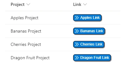
Display a hyperlink column as a clickable button.
Field:
1. Begin with column formatting schema:
{
  "$schema": "https://developer.microsoft.com/json-schemas/sp/column-formatting.schema.json",
  "elmType": "div"
}
2. Style the main div and add child elements:
{
  "$schema": "https://developer.microsoft.com/json-schemas/sp/v2/column-formatting.schema.json",
  "elmType": "div",
  "style": {
    "display": "=if(@currentField,'flex','none')",
    "justify-content": "center"
  },
  "children": [
    {
      "elmType": "div",
      "children": [
        {
          "elmType": "div",
          "children": [
            {
              "elmType": "a"
            }
          ]
        }
      ]
    }
  ]
}
2. Style the the second div (outer button):
{
  "$schema": "https://developer.microsoft.com/json-schemas/sp/v2/column-formatting.schema.json",
  "elmType": "div",
  "style": {
    "display": "=if(@currentField,'flex','none')",
    "justify-content": "center"
  },
  "children": [
    {
      "elmType": "div",
      "attributes": {
        "class": "ms-bgColor-blue ms-bgColor-blueLight--hover ms-fontColor-white ms-fontColor-white--hover"
      },
      "style": {
        "font-size": "12px",
        "border": "1px solid black",
        "border-radius": "7px",
        "box-shadow": "2px 2px 2px #999",
        "cursor": "pointer",
        "display": "flex",
        "align-items": "center"
      },
      "children": [
        {
          "elmType": "div",
          "children": [
            {
              "elmType": "a"
            }
          ]
        }
      ]
    }
  ]
}
3. Style the the third div (icon):
{
  "$schema": "https://developer.microsoft.com/json-schemas/sp/v2/column-formatting.schema.json",
  "elmType": "div",
  "style": {
    "display": "=if(@currentField,'flex','none')",
    "justify-content": "center"
  },
  "children": [
    {
      "elmType": "div",
      "attributes": {
        "class": "ms-bgColor-blue ms-bgColor-blueLight--hover ms-fontColor-white ms-fontColor-white--hover"
      },
      "style": {
        "font-size": "12px",
        "border": "1px solid black",
        "border-radius": "7px",
        "box-shadow": "2px 2px 2px #999",
        "cursor": "pointer",
        "display": "flex",
        "align-items": "center"
      },
      "children": [
        {
          "elmType": "div",
          "attributes": {
            "iconName": "DoubleChevronRight"
          },
          "style": {
            "display": "flex",
            "padding-left": "5px",
            "align-items": "center"
          },
          "children": [
            {
              "elmType": "a"
            }
          ]
        }
      ]
    }
  ]
}
4. Add attributes and styles to the anchor element:
{
  "$schema": "https://developer.microsoft.com/json-schemas/sp/v2/column-formatting.schema.json",
  "elmType": "div",
  "style": {
    "display": "=if(@currentField,'flex','none')",
    "justify-content": "center"
  },
  "children": [
    {
      "elmType": "div",
      "attributes": {
        "class": "ms-bgColor-blue ms-bgColor-blueLight--hover ms-fontColor-white ms-fontColor-white--hover"
      },
      "style": {
        "font-size": "12px",
        "border": "1px solid black",
        "border-radius": "7px",
        "box-shadow": "2px 2px 2px #999",
        "cursor": "pointer",
        "display": "flex",
        "align-items": "center"
      },
      "children": [
        {
          "elmType": "div",
          "attributes": {
            "iconName": "DoubleChevronRight"
          },
          "style": {
            "display": "flex",
            "padding-left": "5px",
            "align-items": "center"
          },
          "children": [
            {
              "elmType": "a",
              "attributes": {
                "class": "ms-fontColor-white ms-fontColor-white--hover",
                "href": "@currentField"
              },
              "txtContent": "@currentField.desc",
              "style": {
                "display": "flex",
                "font-family": "arial",
                "text-decoration": "none",
                "padding": "3px 5px 3px 22px",
                "margin-left": "-17px"
              }
            }
          ]
        }
      ]
    }
  ]
}
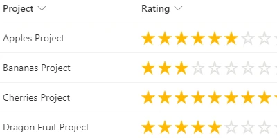
Display an interactive star rating bar. Rate items from low to high.
Field:
  STAR 1
  STAR 2
  STAR 3
  STAR 4
  STAR 5
1. Begin with column formatting schema:
{
  "$schema": "https://developer.microsoft.com/json-schemas/sp/column-formatting.schema.json",
  "elmType": "div"
}
2. Style the main div and add child elements:
{
  "$schema": "https://developer.microsoft.com/json-schemas/sp/v2/column-formatting.schema.json",
  "elmType": "div",
  "style": {
    "font-size": "20px",
    "cursor": "pointer"
  },
  "children": [
    {
      "elmType": "span",
      "style": {
        "padding-right": "4px",
        "display": "inline"
      }
    },
    {
      "elmType": "span",
      "style": {
        "padding-right": "4px",
        "display": "inline"
      }
    },
    {
      "elmType": "span",
      "style": {
        "padding-right": "4px",
        "display": "inline"
      }
    },
    {
      "elmType": "span",
      "style": {
        "padding-right": "4px",
        "display": "inline"
      }
    },
    {
      "elmType": "span",
      "style": {
        "padding-right": "4px",
        "display": "inline"
      }
    }
  ]
}
3. Make each span interactive using customRowAction:
{
  "$schema": "https://developer.microsoft.com/json-schemas/sp/v2/column-formatting.schema.json",
  "elmType": "div",
  "style": {
    "font-size": "20px",
    "cursor": "pointer"
  },
  "children": [
    {
      "elmType": "span",
      "style": {
        "padding-right": "4px",
        "display": "inline"
      },
      "customRowAction": {
        "action": "setValue",
        "actionInput": {
          "YOUR FIELD NAME": "1"
        }
      }
    },
    {
      "elmType": "span",
      "style": {
        "padding-right": "4px",
        "display": "inline"
      },
      "customRowAction": {
        "action": "setValue",
        "actionInput": {
          "YOUR FIELD NAME": "2"
        }
      }
    },
    {
      "elmType": "span",
      "style": {
        "padding-right": "4px",
        "display": "inline"
      },
      "customRowAction": {
        "action": "setValue",
        "actionInput": {
          "YOUR FIELD NAME": "3"
        }
      }
    },
    {
      "elmType": "span",
      "style": {
        "padding-right": "4px",
        "display": "inline"
      },
      "customRowAction": {
        "action": "setValue",
        "actionInput": {
          "YOUR FIELD NAME": "4"
        }
      }
    },
    {
      "elmType": "span",
      "style": {
        "padding-right": "4px",
        "display": "inline"
      },
      "customRowAction": {
        "action": "setValue",
        "actionInput": {
          "YOUR FIELD NAME": "5"
        }
      }
    }
  ]
}
4. Show a star icon or empty star icon according to value:
{
  "$schema": "https://developer.microsoft.com/json-schemas/sp/v2/column-formatting.schema.json",
  "elmType": "div",
  "style": {
    "font-size": "20px",
    "cursor": "pointer"
  },
  "children": [
    {
      "elmType": "span",
      "style": {
        "padding-right": "4px",
        "display": "inline"
      },
      "customRowAction": {
        "action": "setValue",
        "actionInput": {
          "YOUR FIELD NAME": "1"
        }
      },
      "attributes": {
        "iconName": "=if(Number(@currentField) >= 1, 'favoriteStarFill', 'favoriteStar')"
      }
    },
    {
      "elmType": "span",
      "style": {
        "padding-right": "4px",
        "display": "inline"
      },
      "customRowAction": {
        "action": "setValue",
        "actionInput": {
          "YOUR FIELD NAME": "2"
        }
      },
      "attributes": {
        "iconName": "=if(Number(@currentField) >= 2, 'favoriteStarFill', 'favoriteStar')"
      }
    },
    {
      "elmType": "span",
      "style": {
        "padding-right": "4px",
        "display": "inline"
      },
      "customRowAction": {
        "action": "setValue",
        "actionInput": {
          "YOUR FIELD NAME": "3"
        }
      },
      "attributes": {
        "iconName": "=if(Number(@currentField) >= 3, 'favoriteStarFill', 'favoriteStar')"
      }
    },
    {
      "elmType": "span",
      "style": {
        "padding-right": "4px",
        "display": "inline"
      },
      "customRowAction": {
        "action": "setValue",
        "actionInput": {
          "YOUR FIELD NAME": "4"
        }
      },
      "attributes": {
        "iconName": "=if(Number(@currentField) >= 4, 'favoriteStarFill', 'favoriteStar')"
      }
    },
    {
      "elmType": "span",
      "style": {
        "padding-right": "4px",
        "display": "inline"
      },
      "customRowAction": {
        "action": "setValue",
        "actionInput": {
          "YOUR FIELD NAME": "5"
        }
      },
      "attributes": {
        "iconName": "=if(Number(@currentField) >= 5, 'favoriteStarFill', 'favoriteStar')"
      }
    }
  ]
}
5. Apply different colors according to the field value:
{
  "$schema": "https://developer.microsoft.com/json-schemas/sp/v2/column-formatting.schema.json",
  "elmType": "div",
  "style": {
    "font-size": "20px",
    "cursor": "pointer"
  },
  "children": [
    {
      "elmType": "span",
      "style": {
        "padding-right": "4px",
        "display": "inline"
      },
      "customRowAction": {
        "action": "setValue",
        "actionInput": {
          "YOUR FIELD NAME": "1"
        }
      },
      "attributes": {
        "iconName": "=if(Number(@currentField) >= 1, 'favoriteStarFill', 'favoriteStar')",
        "class": "=if(Number(@currentField) >= 1, 'ms-fontColor-yellow', 'ms-fontColor-gray40') + ' ms-fontColor-green--hover'"
      }
    },
    {
      "elmType": "span",
      "style": {
        "padding-right": "4px",
        "display": "inline"
      },
      "customRowAction": {
        "action": "setValue",
        "actionInput": {
          "YOUR FIELD NAME": "2"
        }
      },
      "attributes": {
        "iconName": "=if(Number(@currentField) >= 2, 'favoriteStarFill', 'favoriteStar')",
        "class": "=if(Number(@currentField) >= 2, 'ms-fontColor-yellow', 'ms-fontColor-gray40') + ' ms-fontColor-green--hover'"
      }
    },
    {
      "elmType": "span",
      "style": {
        "padding-right": "4px",
        "display": "inline"
      },
      "customRowAction": {
        "action": "setValue",
        "actionInput": {
          "YOUR FIELD NAME": "3"
        }
      },
      "attributes": {
        "iconName": "=if(Number(@currentField) >= 3, 'favoriteStarFill', 'favoriteStar')",
        "class": "=if(Number(@currentField) >= 3, 'ms-fontColor-yellow', 'ms-fontColor-gray40') + ' ms-fontColor-green--hover'"
      }
    },
    {
      "elmType": "span",
      "style": {
        "padding-right": "4px",
        "display": "inline"
      },
      "customRowAction": {
        "action": "setValue",
        "actionInput": {
          "YOUR FIELD NAME": "4"
        }
      },
      "attributes": {
        "iconName": "=if(Number(@currentField) >= 4, 'favoriteStarFill', 'favoriteStar')",
        "class": "=if(Number(@currentField) >= 4, 'ms-fontColor-yellow', 'ms-fontColor-gray40') + ' ms-fontColor-green--hover'"
      }
    },
    {
      "elmType": "span",
      "style": {
        "padding-right": "4px",
        "display": "inline"
      },
      "customRowAction": {
        "action": "setValue",
        "actionInput": {
          "YOUR FIELD NAME": "5"
        }
      },
      "attributes": {
        "iconName": "=if(Number(@currentField) >= 5, 'favoriteStarFill', 'favoriteStar')",
        "class": "=if(Number(@currentField) >= 5, 'ms-fontColor-yellow', 'ms-fontColor-gray40') + ' ms-fontColor-green--hover'"
      }
    }
  ]
}
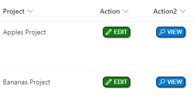
Display a simple view or edit button to open the SharePoint form.
Field:
1. Begin with column formatting schema:
{
  "$schema": "https://developer.microsoft.com/json-schemas/sp/column-formatting.schema.json",
  "elmType": "div"
}
2. Add styling to the main div:
{
  "$schema": "https://developer.microsoft.com/json-schemas/sp/column-formatting.schema.json",
  "elmType": "div",
  "style": {
    "display": "flex",
    "justify-content": "center"
  }
}
3. Add a child button element with customRowAction, attributes and style properties.
{
  "$schema": "https://developer.microsoft.com/json-schemas/sp/column-formatting.schema.json",
  "elmType": "div",
  "style": {
    "display": "flex",
    "justify-content": "center"
  },
  "children": [
    {
      "elmType": "button",
      "customRowAction": {
        "action": "defaultClick"
      },
      "attributes": {
        "class": "ms-fontColor-white ms-fontColor-black--hover"
      },
      "style": {
        "border": "none",
        "cursor": "pointer",
        "background-color": "transparent"
      }
    }
  ]
}
4. Add a div inside the button with styling.
{
  "$schema": "https://developer.microsoft.com/json-schemas/sp/column-formatting.schema.json",
  "elmType": "div",
  "style": {
    "display": "flex",
    "justify-content": "center"
  },
  "children": [
    {
      "elmType": "button",
      "customRowAction": {
        "action": "defaultClick"
      },
      "attributes": {
        "class": "ms-fontColor-white ms-fontColor-black--hover"
      },
      "style": {
        "border": "none",
        "cursor": "pointer",
        "background-color": "transparent"
      },
      "children": [
        {
          "elmType": "div",
          "attributes": {
            "class": "ms-bgColor-blue ms-bgColor-blueLight--hover ms-fontColor-white ms-fontColor-black--hover"
          },
          "style": {
            "font-size": "12px",
            "font-family": "arial",
            "border": "1px solid Black",
            "border-radius": "7px",
            "padding": "3px 5px 3px 5px",
            "box-shadow": "2px 2px 2px #999"
          }
        }
      ]
    }
  ]
}
5. Add two more divs inside the button div for the icon and label.
{
  "$schema": "https://developer.microsoft.com/json-schemas/sp/column-formatting.schema.json",
  "elmType": "div",
  "style": {
    "display": "flex",
    "justify-content": "center"
  },
  "children": [
    {
      "elmType": "button",
      "customRowAction": {
        "action": "defaultClick"
      },
      "attributes": {
        "class": "ms-fontColor-white ms-fontColor-black--hover"
      },
      "style": {
        "border": "none",
        "cursor": "pointer",
        "background-color": "transparent"
      },
      "children": [
        {
          "elmType": "div",
          "attributes": {
            "class": "ms-bgColor-blue ms-bgColor-blueLight--hover ms-fontColor-white ms-fontColor-black--hover"
          },
          "style": {
            "font-size": "12px",
            "font-family": "arial",
            "border": "1px solid Black",
            "border-radius": "7px",
            "padding": "3px 5px 3px 5px",
            "box-shadow": "2px 2px 2px #999"
          },
          "children": [
            {
              "elmType": "div",
              "attributes": {
                "iconName": "Search"
              },
              "style": {
                "display": "inline-block",
                "vertical-align": "middle",
                "padding-right": "5px"
              }
            },
            {
              "elmType": "div",
              "txtContent": " VIEW",
              "style": {
                "display": "inline-block",
                "font-family": "arial",
                "vertical-align": "middle"
              }
            }
          ]
        }
      ]
    }
  ]
}