SharePoint Charts Complete Training
This training program provides step-by-step instructions using videos and downloadable materials.
You will be creating all demonstrated charts shown in your own SharePoint environment.
The full series of training videos can be found here: SharePoint Charts Complete Training on YouTube
It is often the case that you will need to build a list to store summary data. This is necessary when charts are rendered from one row of data. A pie chart is an example of a chart that is rendered from one row of data.
In many cases you may be charting from information that originates in lists of hundreds or even thousands of records. In this case you will need to aggregate data then show summary numbers in a second list.
In order to do use all kinds of charting templates, you will need to become proficient in use of automated workflows using Power Automate.
In this training session we will be creating two lists help-tickets and help-tickets-summary from the provided Excel workbooks linked below.
Begin by downloading these workbooks to your computer.
» Download help-tickets-summary.xlsx
Follow the steps in the video tutorial: (42 minutes)
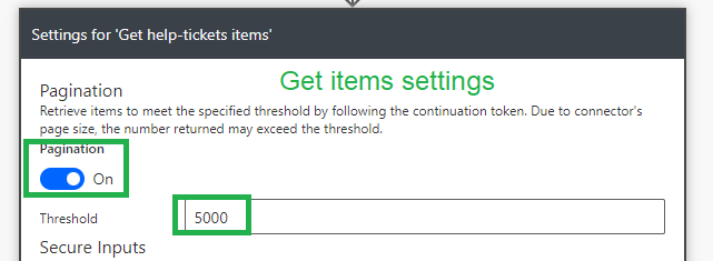
Start your workflow with the Get items action to pull back all records from your SharePoint list.
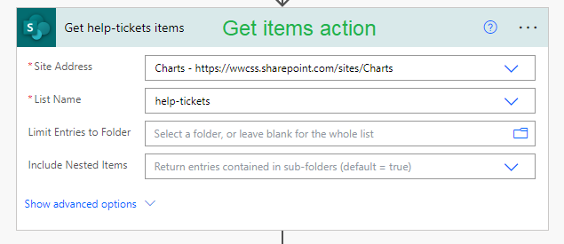
Adjust the settings on your Get items action so that the workflow can pull back more than 100 records.
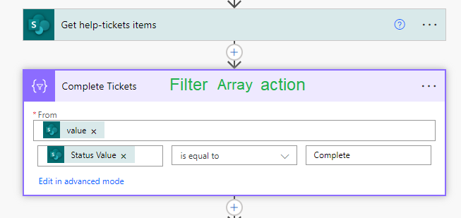
In order to get counts of records based on a filter use multiple Filter Array actions. (For example when Status is Complete.)
In order to sum from a SharePoint column there are some special commands needed.
1. Use the Select command to select your number field from the Get Items preceding get items action.
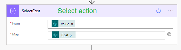
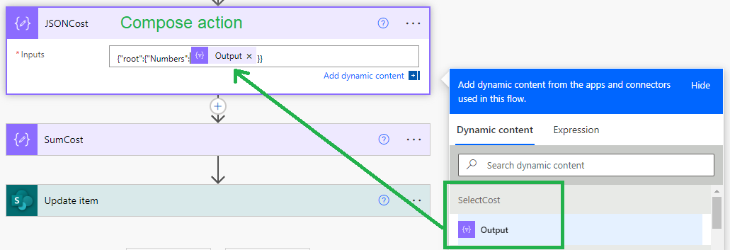
2. Use a compose action to convert the select output to JSON.
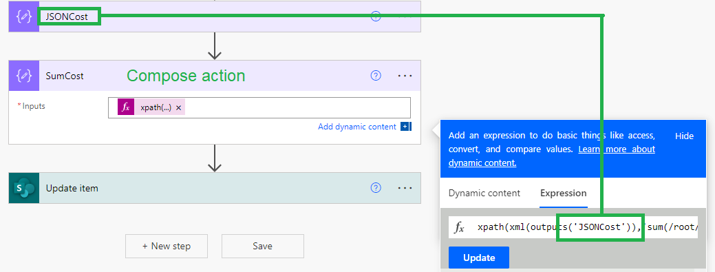
3. Use a compose action to invoke a special xpath command which sums the data.
Copy and paste these commands to your workflow. These are used in steps 2 and 3 which are Power Automate Compose actions.
Convert Select Output to JSON
(Delete YOUR_SELECT_OUTPUT and insert a reference to the preceding Select command.)
{"root":{"Numbers":YOUR_SELECT_OUTPUT}}
XPath Sum Command
(Delete YOUR_OUTPUT_NAME and type the name of the preceding compose command)
xpath(xml(outputs('YOUR_OUTPUT_NAME')),'sum(/root/Numbers)')
Now that all summary totals are ready, you can write the data back your summary list.
Use the Update item command to update the target record.
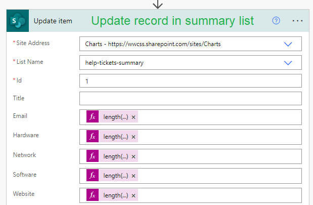
Use the Length() function on the Filter query results to access counts.
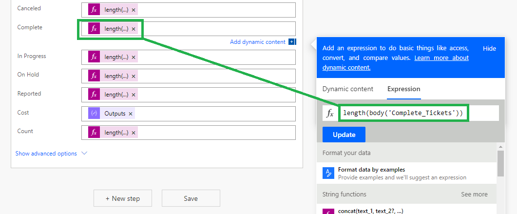
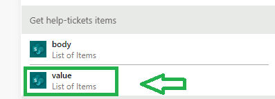
Note that when getting the total count of records from the Get items action, use the length() function with value list of items.
(Don't pick the other option which is Body list of items.)
The first chart you will create is easy to set up and only requires 3 fields.
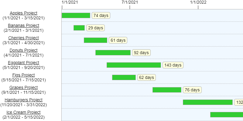
The Gantt Chart template allows you to compare date ranges between records like projects.
There are many formatting options to get exactly the appearance that you want.
Begin by downloading the gantt-chart workbook to your computer.
Access the Gantt Chart Template here:
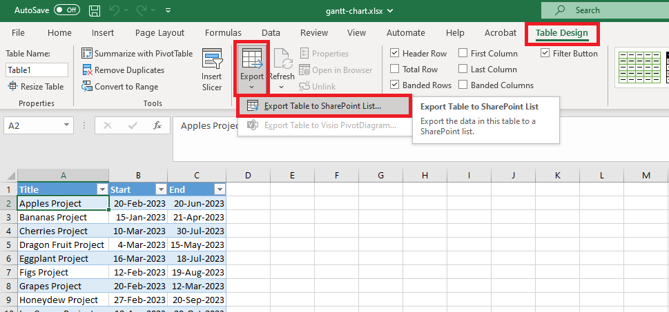
Use the Export Table to SharePoint List option to create a new SharePoint list from the provided workbook.
All further instructions are provided in the video below: (19 minutes)
Commonly charts show a progression over time.
For example, you may want to show monthly sales totals over the course of a year.
Similar to the previous training on summary data, we will need to use Power Automate to get totals for each date range.
Depending on the chart template, the summary data may be written to one record or it may be written to multiple records.
We'll learn how to gather summary data for both scenarios.
For this training, we'll be getting summary totals for our fictional company "Wise Industries".
We have a list of orders with order dates. We want to chart the total amount of orders for each month of the year.
Begin by downloading three workbooks to your computer:
» Download wise-industries-orders.xlsx
» Download wise-industries-counts-one-row.xlsx
» Download wise-industries-counts-multi-row.xlsx
Further instructions are provided in the video below: (37 minutes)
When gathering date range data for one record, you will use the regular Get items action followed by Filter array actions to get sets of records according to a date range.
In order to use a compound condition in our filter array, we need to use the Edit in advanced mode setting.
It is easiest to copy and paste the formula from a text editor to the formula box.
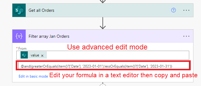
Use this code snippet. Change the date values accordingly.
@and(greaterOrEquals(item()?['Date'], '2023-01-01'),lessOrEquals(item()?['Date'], '2023-01-31'))
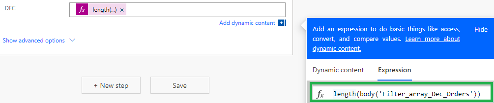
When updating your summary record, length() function as we did before in our previous summary data training.
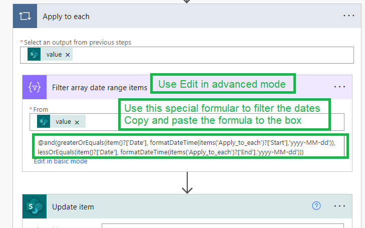
When gathering date range data for multiple records, you will use the regular Get items action followed by a second Get items action which loops through each row of your summary data list.
We only need one Filter array action which is used repeatedly for each record.
Use this code snippet. Make sure that you don't change the name of the Apply to each block.
@and(greaterOrEquals(item()?['Date'], formatDateTime(items('Apply_to_each')?['Start'],'yyyy-MM-dd')), lessOrEquals(item()?['Date'], formatDateTime(items('Apply_to_each')?['End'],'yyyy-MM-dd')))
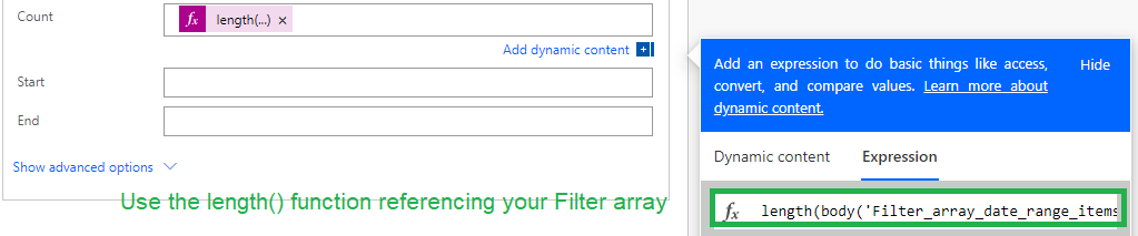
Last update the Count field by using the length() function on your Filter array.
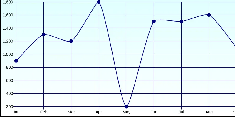
Line charts are one of the most common and easily understood charts.
This is a simple to set up template that requires a single row of data.
Begin by downloading this workbook to your computer:
» Download wise-industries-monthly-sales.xlsx
Access the Gantt Chart Template here:
Export the list to your training site then follow the steps in the video below: (19 minutes)
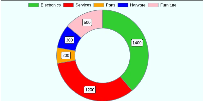
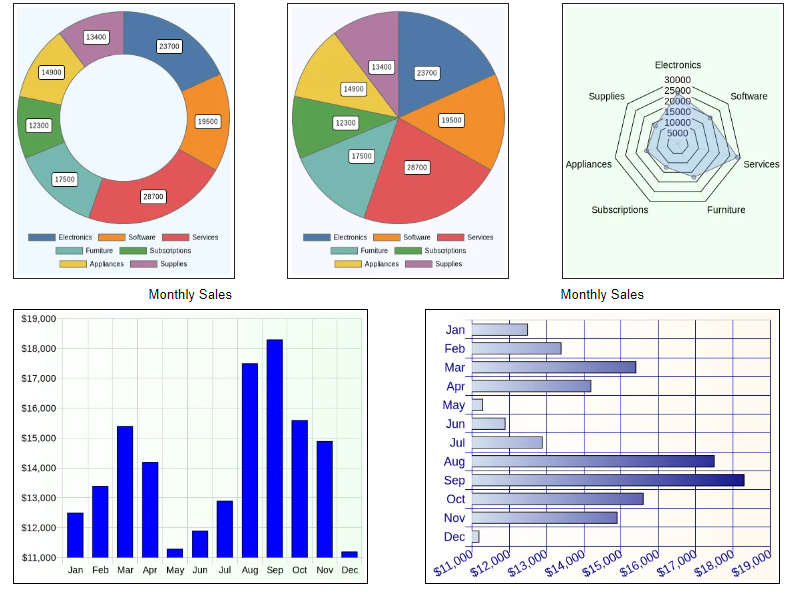
Pie charts and donut charts require a single row of data.
Begin by downloading this workbook to your computer:
» Download wise-industries-category-sales.xlsx
Access the Pie Chart Template here:
Access the Donut Chart Template here:
Export the list to your training site then follow the steps in the video below: (23 minutes)/p>
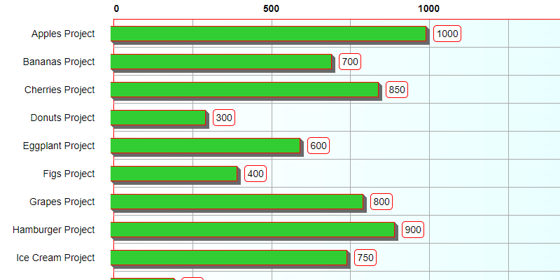
Bar charts can be made from either a single row of data or multiple rows of data.
Begin by downloading these workbooks to your computer:
» Download wise-industries-monthly-expenses-one-row.xlsx
» Download wise-industries-monthly-expenses-multi-row.xlsx
Access the Horizontal Bar Chart - 1 row of data template here:
» Horizontal Bar Chart / 1 row of data
Access the Horizontal Bar Chart - multiple rows of data template here:
» Horizontal Bar Chart / multiple rows of data
Access the Vertical Bar Chart - 1 row of data template here:
» Vertical Bar Chart / 1 row of data
Access the Vertical Bar Chart - multiple rows of data template here:
» Vertical Bar Chart / multiple rows of data
Export the lists to your training site then follow the steps in the video below: (34 minutes)
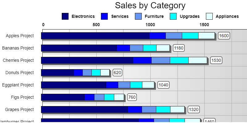
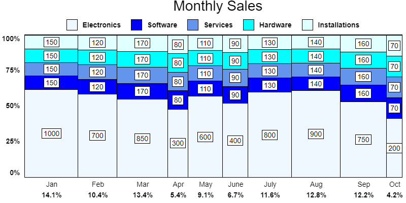
Grouped bar charts and stacked bar charts can be made from multiple rows of data.
This chart compares a group of data in a series either side by side or stacked showing the combined total value.
Begin by downloading this workbook to your computer:
» Download wise-industries-sales-by-category.xlsx
Access the grouped bars template here:
Access the grouped columns template here:
Access the stacked bars template here:
Access the stacked columns template here:
Export the list to your training site then follow the steps in the video below: (25 minutes)
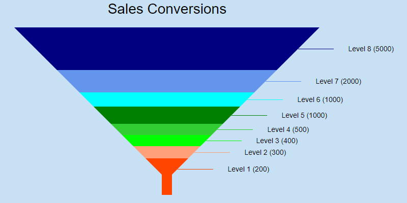
Funnel charts and pyramid charts are made from a single row of data.
This chart shows a progression of numbers in a process ranging from large to small.
A common example is a sales process where you start with many prospective leads and after a series of steps result in a comparitively small amount of converted customers.
Funnel charts and pyramid charts display data in the same way.
A funnel chart is the same display an inverted pyramid chart.
Begin by downloading this workbook to your computer:
» Download customer-levels.xlsx
Access the funnel chart template here:
Access the pyramid chart template here:
Export the list to your training site then follow the steps in the video below. (16 minutes)

Org charts are made from multiple row of data.
This template requires enabling Add and Customize Pages option for your site.
A user with SharePoint Admin permissions must complete these steps: Enable Add and Customize Pages in your site
Note that this is required only once per site.
Org charts require downloading and using a special org chart list template:
An org chart shows the structure of your organization. In particular it demonstrates who is a member of each team and who the managers are incluing upper management.
In general, it works best to create multiple org charts in distinct list views for each of the teams.
Access the org chart template here:
Once your list template is loaded to your site, follow the steps in the video below. (22 minutes)
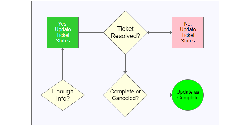
Flow charts are made from multiple row of data.
This template requires enabling Add and Customize Pages option for your site.
A user with SharePoint Admin permissions must complete these steps: Enable Add and Customize Pages in your site
Note that this is required only once per site.
Flow charts require downloading and using a special flow chart list template:
An flow chart shows the a process with decisions and branching logic. It is useful for planning and training to demonstrate the steps and decisions in a process.
Access the flow chart template here:
Once your list template is loaded to your site, follow the steps in the video below. (19 minutes)
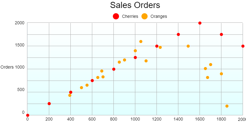
Scatter plot and bubble charts are made from multiple row of data.
A scatter plot diagram is useful in identify a trend in data based on plotting many data points.
A bubble chart is adds an additional dimension to a scatter plot by allowing plot point to expand to bubbles which change size according to that additional dimension.
If you have never worked with these kinds of charts, it is recommended to first search the web for examples of each chart type to better understand the kinds of data that match up best.
Begin by downloading these workbooks to your computer:
» Download category-sales.xlsx
Access the scatter plot template here:
Access the bubble chart template here:
To get started follow the steps in the video below. (25 minutes)
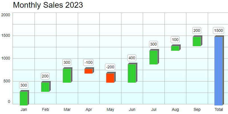
Waterfall charts are made from multiple row of data.
A waterfall chart shows an accumulation of values in a series trending over time.
See explanation of waterfall charts.
Begin by downloading this workbook to your computer:
» Download monthly-profits.xlsx
Access the waterfall chart template here:
To get started follow the steps in the video below. (15 minutes)
Marimekko charts are made from multiple row of data.
A marimekko chart demonstrates the proportion of value categories both on the x and y axis.
You can think of a marimekko chart as a stacked bar chart that works in both vertically and horizontally.
See explanation of marimekko charts.
We will begin by modifying the list we previously created in the training on stacked bar charts.
This is the list that was made from the workbook used previously:
» Download wise-industries-sales-by-category.xlsx
Access the marimekko chart template here:
Use this code snippet to get your calculated field percent value. Change the field references accordingly.
Set the field for number output with 1 decimal place.
=MonthTotal/SeriesTotal*100
To get started follow the steps in the video below. (15 minutes)
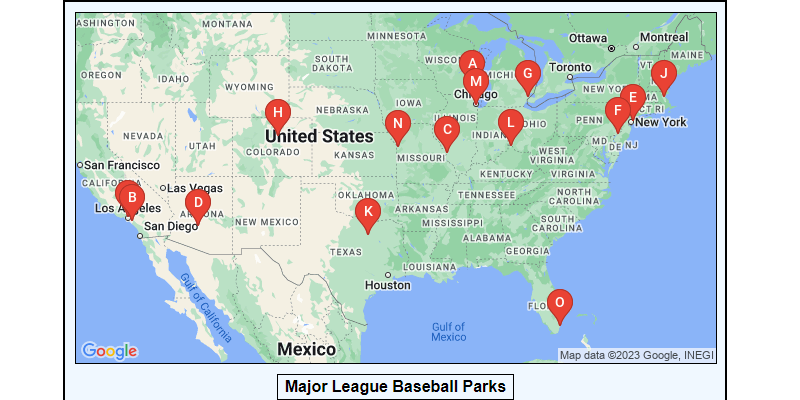
Maps can be displayed from single rows of data or multiple row of data.
Mapping templates can be created using either the Google Maps API or Bing Maps API.
This training will use the Google Maps templates.
(Bing Maps templates are very similar and can be created easily once you have done this straining.)
Before you begin this training, get your free Google Maps API key using the link above.
We will be creating our own list in SharePoint for this training.
Access the Google Maps card template here:
Access the Google Pushpins Map template here:
» Google Pushpins Map template
Access the Google Streetview template here:
To get started follow the steps in the video below. (26 minutes)
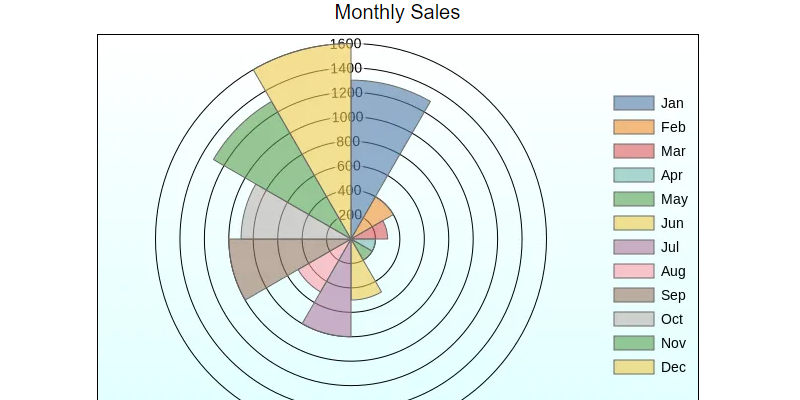
Polar charts and radar charts are displayed from a single row of data.
Polar charts and radar charts work in a similar manner.
Sections are plotted from the center used as the starting point and the outside edge representing the high end of the scale.
We will begin by modifying the list we previously created in the training on pie charts and donut charts.
This is the list that was made from the workbook used previously:
» Download wise-industries-category-sales.xlsx
Access the polar chart template here:
Access the radar chart template here:
To get started follow the steps in the video below. (16 minutes)
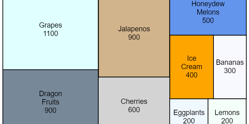
Proportional Area charts are displayed from a single row of data.
This chart works well in a scenario where you might otherwise use a pie chart.
Rectangular sections are drawn automatically which are exactly proportional to the values provided.
One advantage is that labels can more easily be applied using this chart compared to a pie chart.
We will begin by modifying the list we previously created in the training on pie charts and donut charts.
This is the list that was made from the workbook used previously:
» Download wise-industries-category-sales.xlsx
Access the proportional area chart template here:
» Proportional area chart template
To get started follow the steps in the video below. (8 minutes)
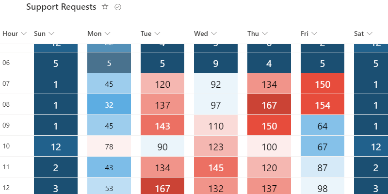
Heat maps are displayed from multiple rows of data.
This chart lends itself to a grid of numbers where you want to "hot spots" and "low spots" where data is close to (or beyond) the boundaries that you define.
The background colors are drawn on a color spectrum that you select in 20 different shades ranging according to your color set selection.
This charting template is different than others in that it uses a column formatting template instead of view formatting template.
Therefore, you will apply this template on each column of data.
We will begin by creating a list from an Excel workbook with training data.
Begin by downloading the workbook here:
» Download support-tickets.xlsx
Access the heat map template here:
Begin the training by following the steps in the video below. (14 minutes)
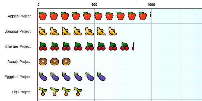
Pictograms are displayed from multiple rows of data.
Pictograms are horizontal bar charts which use pictures instead of bars corresponding to the data points.
This is a more creative and visually interesting way to show a bar chart.
We will begin by creating a list directly in SharePoint using data from a previous training.
Access the pictogram template here:
Begin the training by following the steps in the video below. (15 minutes)
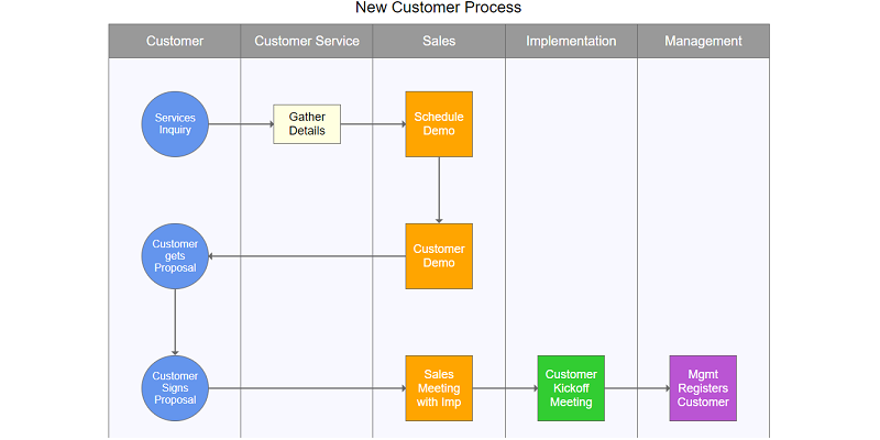
Swim lanes charts are displayed from multiple rows of data.
Swim lanes charts are flow charts with columns showing a division of processes between groups.
The term swim lanes refers to this chart looking like swim lanes in a pool.
If you are new to swim lanes diagrams, you can learn more here.
We will be using the same list created previously in flow charts training.
You must complete flow charts training above before doing this training.
Access the swim lanes template here:
Begin the training by following the steps in the video below. (20 minutes)

Multiple charts can be placed together on a SharePoint page.
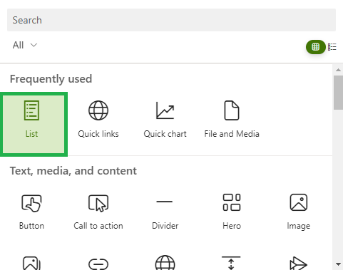
Charts can be placed on a modern page using the list web part.
In the web part settings, select the view corresponding to the chart and hide the command bar and button as shown.
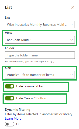
Page sections split into 3 columns require charts set to 320px width.
Page sections split into 2 columns require charts set to 520px width.
Full width page sections don't require any adjustment to the width of your charts.
Begin the training by following the steps in the video below. (15 minutes)